Generate code to embed a diagram in a webpage
You can easily save your diagram as an image or a SVG file, which you can embed in your website. Or you can embed HTML or an IFrame into your web page as described below.
Select File > Embed.
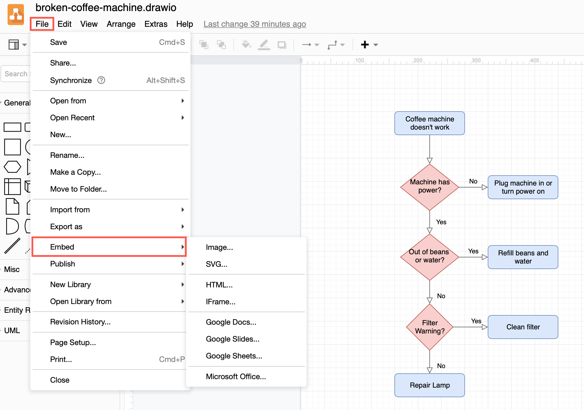
Embed a diagram using HTML
- Select File > Embed > HTML to open the HTML options dialog.
- Select from the following embed HTML options, then click on Create.
- Include a copy of your diagram in the HTML or use the public link to your original diagram file.
- Choose whether you want Links to open in the current window or in a new window, and change the Border Color to change the link highlight colour.
- Set your diagram to open in dark or light mode (default Appearance is Automatic).
- Choose whether to zoom in or out.
- Select you want to include all pages, layers, and/or tags.
- If you want to display the diagram in a lightbox, choose what should happen when a user clicks on the edit icon.
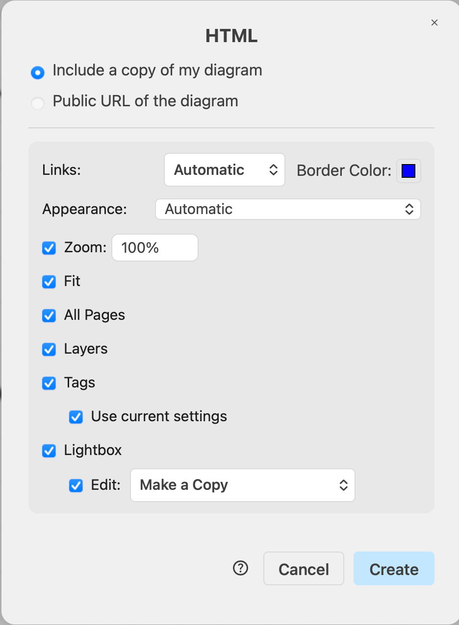
- Copy the generated HTML code and paste it into your webpage.
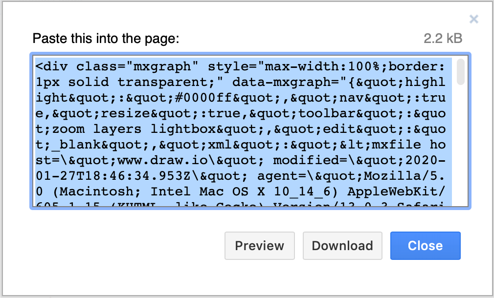
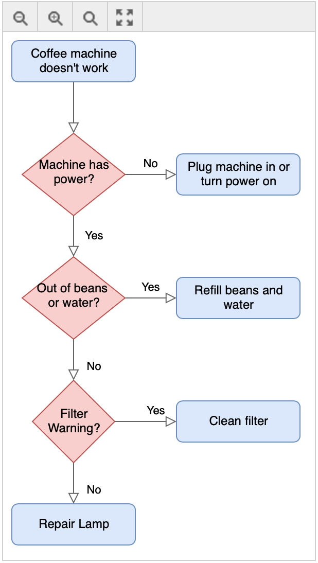
When you load the webpage in your browser, the diagram will appear with a toolbar, if you have used the default settings.
Embed a diagram using an IFrame
An IFrame (Inline Frame) is an HTML document embedded inside another HTML document on a website. This means that your diagram file must be stored as a public file - for example on Google Drive.
- Select File > Embed > IFrame to open the IFrame options dialog.
- Set the options you want to use within the IFrame. They are similar to the HTML options described above. Once you are done, click Create.
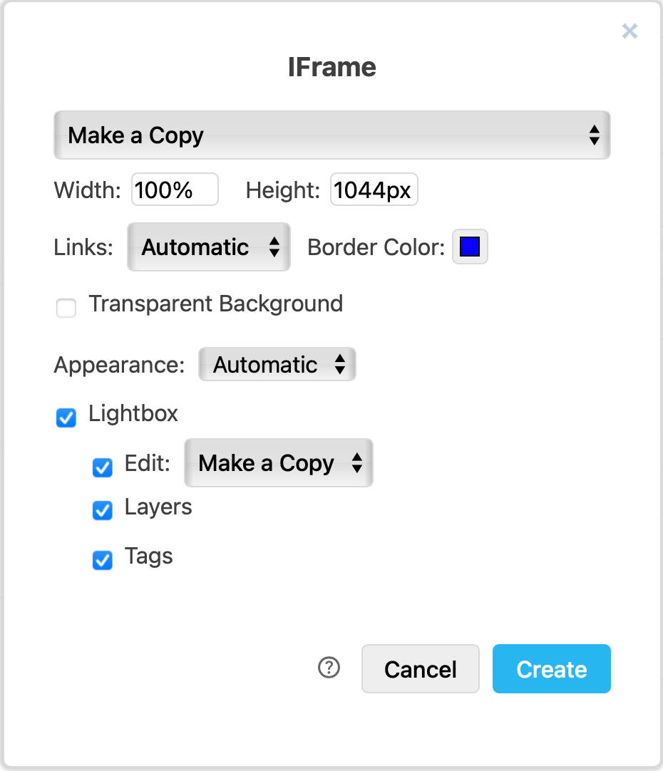
- By default, when you open the link it will create a copy of the diagram in the users' browser. If you have saved your diagram on a cloud platform, you can change this to Authorisation required, or to share the Public URL of the diagram.
- Set the Width and Height to change the size of the diagram iFrame.
- Choose whether you want Links to open in the current window or in a new window, and change the Border Color to change the link highlight colour.
- Set a transparent background.
- If you want to display the diagram in a Lightbox, choose what should happen when a user clicks on the Edit icon.
- Select you want to include layers and/or tags.
- draw.io will generate the HTML code that contains the IFrame. Copy this HTML code containing the IFrame, and paste it into your web page.
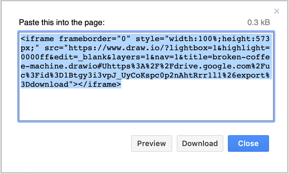
IFrames use the draw.io lightbox and centre the diagram in the page. If you have used the default settings, a toolbar will appear at the bottom of your diagram when you hover over the HTML page.
Options
The HTML markup requires a remote script to be loaded to render the diagram in the page. Embedded HTML supports pages, links, collapse/expand, layers, zoom, mathematical typesetting, and includes a built-in lightbox as well as displaying as a vector image that is suited for retina displays.
The dialog exposes the following options:
- Include a copy of my diagram: Includes the XML copy of your diagram by default.
- Public URL of the diagram: Uses the public URL to load the diagram, if available.
- Links: Specifies how to open links (
automaticmeans relative links and anchors open in the same window). - Border Color: Sets the highlight colour for the border of shapes with links.
- Appearance: Allows you to force the diagram to display in dark or light mode (default is Automatic).
- Zoom: Specifies whether the viewer should have a toolbar with a zoom feature and an initial zoom value (default is 100%).
- Fit: Adjusts the diagram to fill the available width of the page or container.
- All Pages: Choose whether to include all pages of a multi-page diagram, or just the current page.
- Layers: Specifies whether individual layers can be shown or hidden in the viewer and lightbox.
- Tags: Specifies whether individual tags can be shown or hidden in the viewer and lightbox.
- Lightbox: Opens the diagram in a new tab or using the built-in lightbox.
- Show Edit Button: Shows an Open in new window button in the lightbox.
If you enable Layers or Zoom, a toolbar will be displayed with those controls over the diagram. When you have enabled Zoom, the container size will change as you zoom in/out.
Configuration
The configuration and data are stored in a JSON object in the data-mxgraph attribute. Use the following settings to configure the viewer:
xml/url=data: Specifies the XML or URL for the diagram. URL takes precedence over XML.toolbar=[pages|zoom|layers|lightbox|custom]: Specifies tools to include on the toolbar (e.g.toolbar=layers lightbox). Custom entries are required to have a matching key intoolbarButtons.toolbar-buttons={...}: Defines the toolbar buttons with the form:{key:{title: string, image: base64-encoded, handler: function[, enabled: false]}, key...}toolbar-nohide=true: Ensures the toolbar is always displayed.max-height=value: Sets the maximum initial height of the diagram.auto-fit=false: Disables the automatic zoom (if zoom buttons are not visible).auto-crop=true: Enables automatic cropping if layers can be toggled.check-visible-state=false: Disables delayed rendering.lightbox=[false|open]: Disables or forces the lightbox to open in new window.layers=[index0 index1 ...]: Specifies a space-separated list of visible layers (e.g.layers=0 1).tooltips=false: Disables tooltips.toolbar-position=[top|inline|bottom]: Sets the toolbar's position (default istop).zoom=value: Sets the initial zoom (default is1).editable=false: Disables editing from the lightbox (default is1).allow-zoom-in=true: Forces auto-fit and specifies whetherzoom > 1is allowed.border=value: Specifies the amount of padding around the diagram (default is8).page=value: Selects the initial page (default is0).nav=false: Disables collapse/expand.resize=[true|false]: Forces or disables the container resize after changes have been made.center=[true|false]: Specifies whether the diagram should be centred (default isfalse).target=[self|blank]: Opens links in the same/new window (default opens relative links and anchors in thesamewindow).move=true: Sets whether collapse/expand moves siblings.title=value: Sets an optional title for the toolbar (or a tooltip if no toolbar is visible).edit=url|_blank: Sets an optional link for when you click on Open in new window in the lightbox (where_blankopens a copy of the diagram).show-link-icons=true: Shows link icons on shapes that have links (default isfalse).show-tooltip-icons=true: Shows tooltip icons on shapes that have tooltips (default isfalse).browser-translate=false: Disables mirroring of diagram text into a hidden HTML container for browser translation features (e.g. Chrome Translate). This is enabled by default.
By default, links to anchors, relative links or links to the same domain open in the same window, even if the embedded diagram is inside an iframe. All other links open in a new window unless target=self is specified.
To close the lightbox, press Esc, or click on the darker background, the close icon (X) in the top right corner, or the close symbol in the toolbar.
If the CSS border of the container is transparent (default) or non-null, the container border will change when you hover over it with the mouse. If enabled, the toolbar will be shown and a margin will be added.
The responsive switch is implemented using max-width:100%.
Requirements
Embedded HTML requires JavaScript support. Supported browsers are: Microsoft Internet Explorer 6 and later, Microsoft Edge, Safari, Chrome, Firefox, Android, iOS, Microsoft and Chromebook touch devices.