Diagram, chart or graph?
Have you been asked to create a chart, a diagram, or a graph? There is a lot of confusion around these overlapping terms, especially as they are most often used interchangeably. However, there are some minor differences in how they are used.
Here's a rough guide to the difference between charts, graphs, diagrams, figures, plots, maps, and models.
Diagrams
You could think of diagrams as the super-category: Anything that visualises information in an abstract way is a diagram. For example, an image with labels, a tree diagram categorising items, a floor plan, an infographic, an electrical wiring diagram, a process flow, and so on.
A good rule of thumb for using more specific terms - when the visualisation is driven by a numerical data set, chart, graph or plot will be more accurate.
Graphs
Graphs usually represent quantitative data on an 2D image with an x-y axis, using lines or bars. Graphs can visualise numerical data or a mathematical function, and are often generated from data in a spreadsheet.
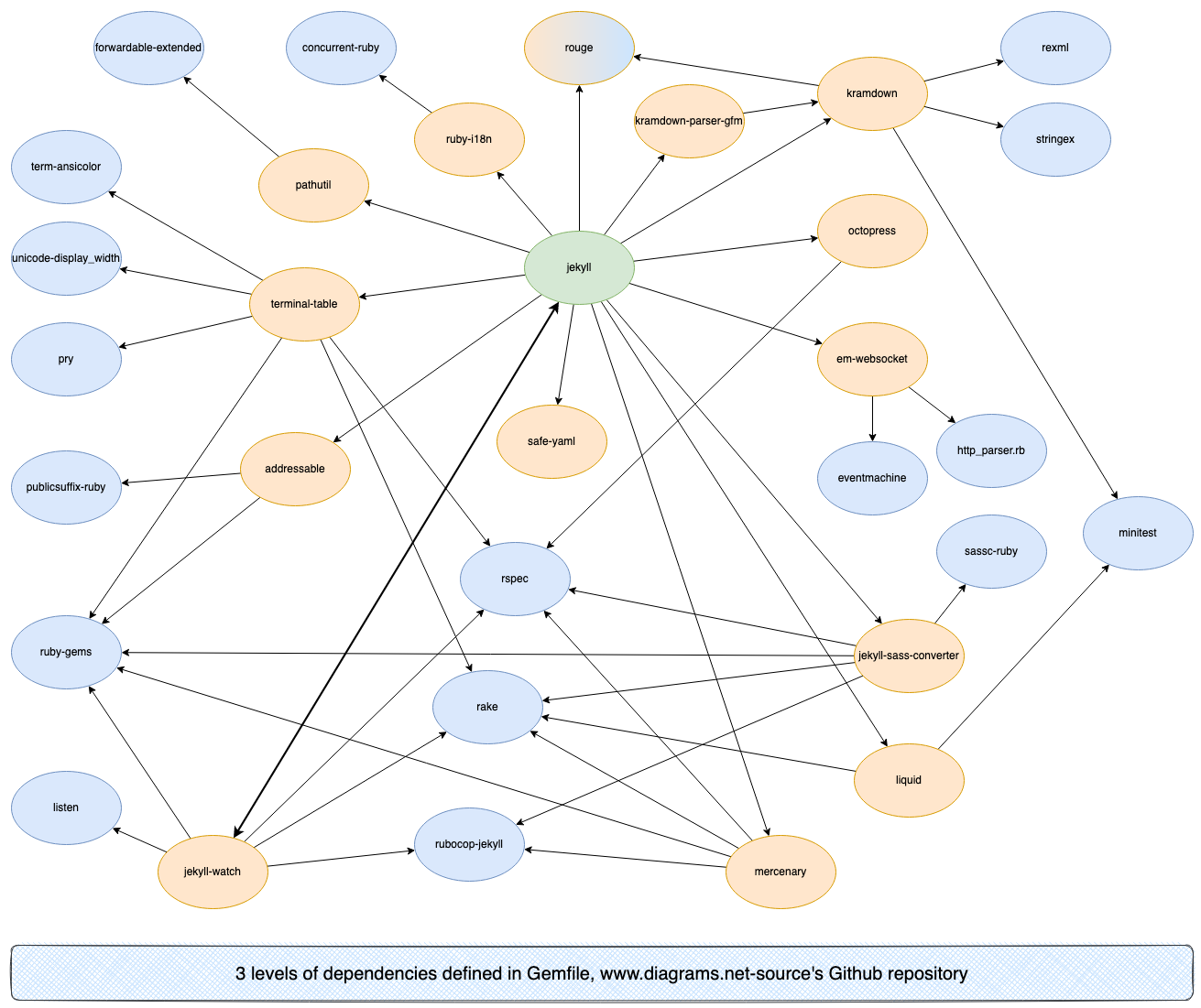
The word 'graph' is used outside of this context. For example, infographics explain complex topics in simple abstract visualisations, and dependency graphs show relationships between various elements.
Plots
Plots are not as often encountered. They are generated from a numerical data set and commonly used in mathematics, finance, and engineering. Individual data points are plotted on a 2D or 3D axis, for example, as a scatterplot.
Charts
Charts also represent quantitative data. Charts can be graphs (line charts), but some aren't (pie charts). Many charts put quantitative data on one axis, and categories (qualitative data) on the other axis.
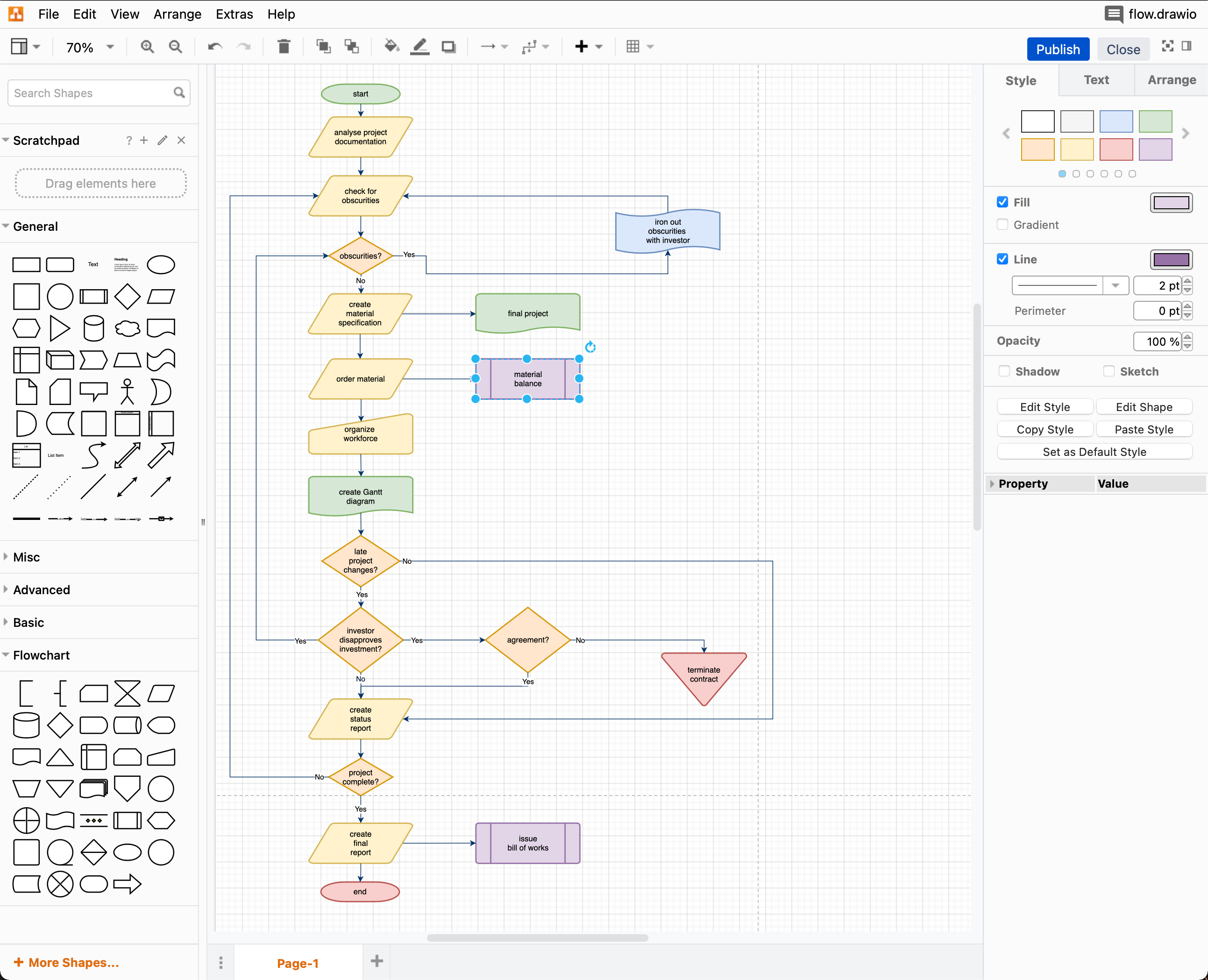
However, the word 'chart' is also used to refer to several other types of diagrams (that often don't display quantitative data): flowcharts, Gantt charts, organisation charts, and relationship charts.
Figures
Figure has so many different meanings that depend on the context in which it is used. The most common usage refers to any image, drawing, graph, diagram, chart or plot in a reference book, scientific paper, or digital resource.
The word 'figure' can also be used to mean 'number' - e.g. a figure 8, or a table of sales figures.
Maps and models and plans
To complicate matters even more, maps, models and plans are also words used to refer to specific types of diagrams.
- Story mapping and roadmaps are used in product marketing, and mindmaps are used to explore subject areas when brainstorming.
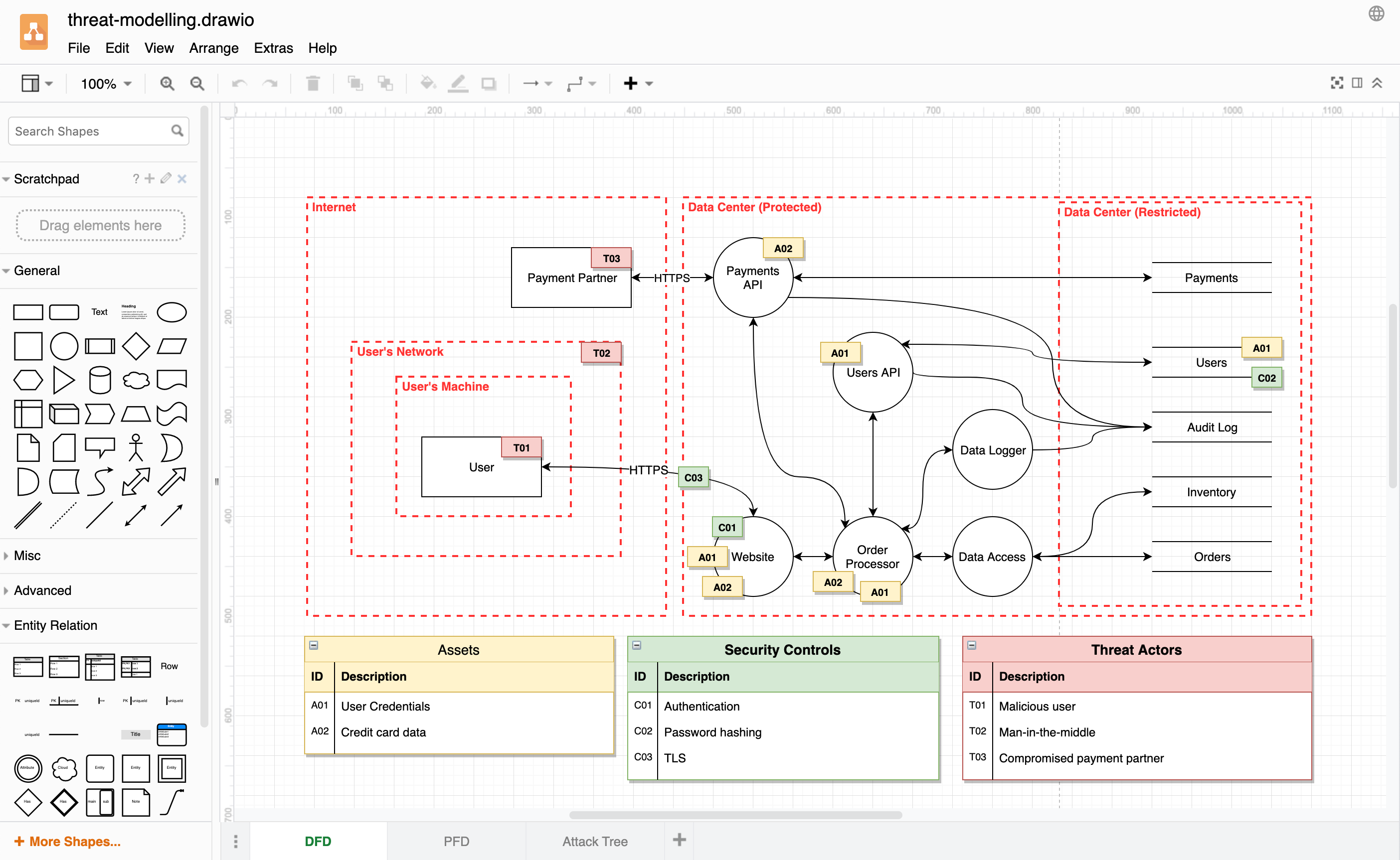
- C4 models describe and define IT architectures, application threat models are used to explore infrastructure risks, and wireframe models can represent physical objects or the layout of a digital product.
- Floorplans or floormaps show the layout of an indoor space.
Templates for all types of diagrams
Our draw.io apps come with many templates, organised into categories in the template library roughly corresponding to the terms described above.
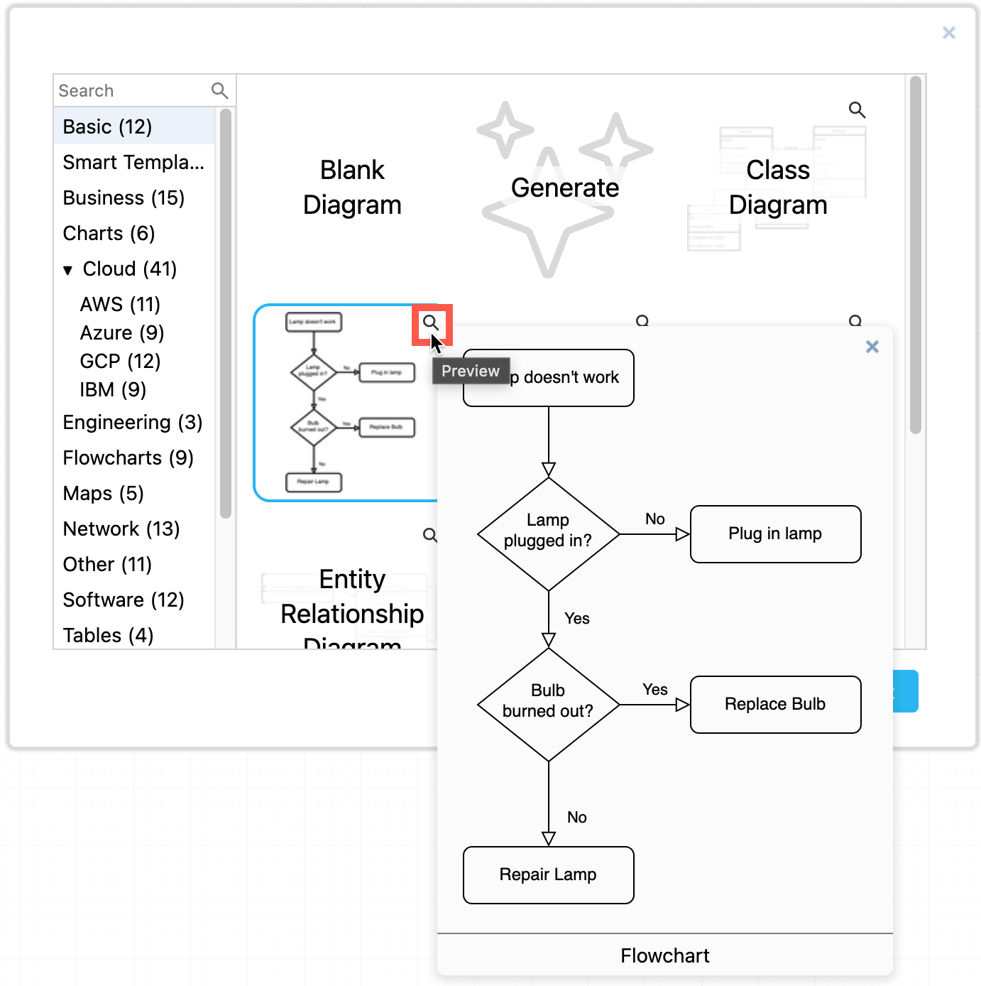
- Select Arrange > Insert > Template to open the template library.
- Browse the categories on the left and select a template on the right. Click on the magnifying glass to see a larger preview.
- Click Insert to add it to the drawing canvas.
Tip: You can also generate a diagram from a text description of your particular diagram.
- click on Generate in the Basic section of the library
- click on the Generate button in the toolbar to open the Generate dialog.
- describe your diagram in text in the search field and select Generate.
Shapes for different types of diagrams
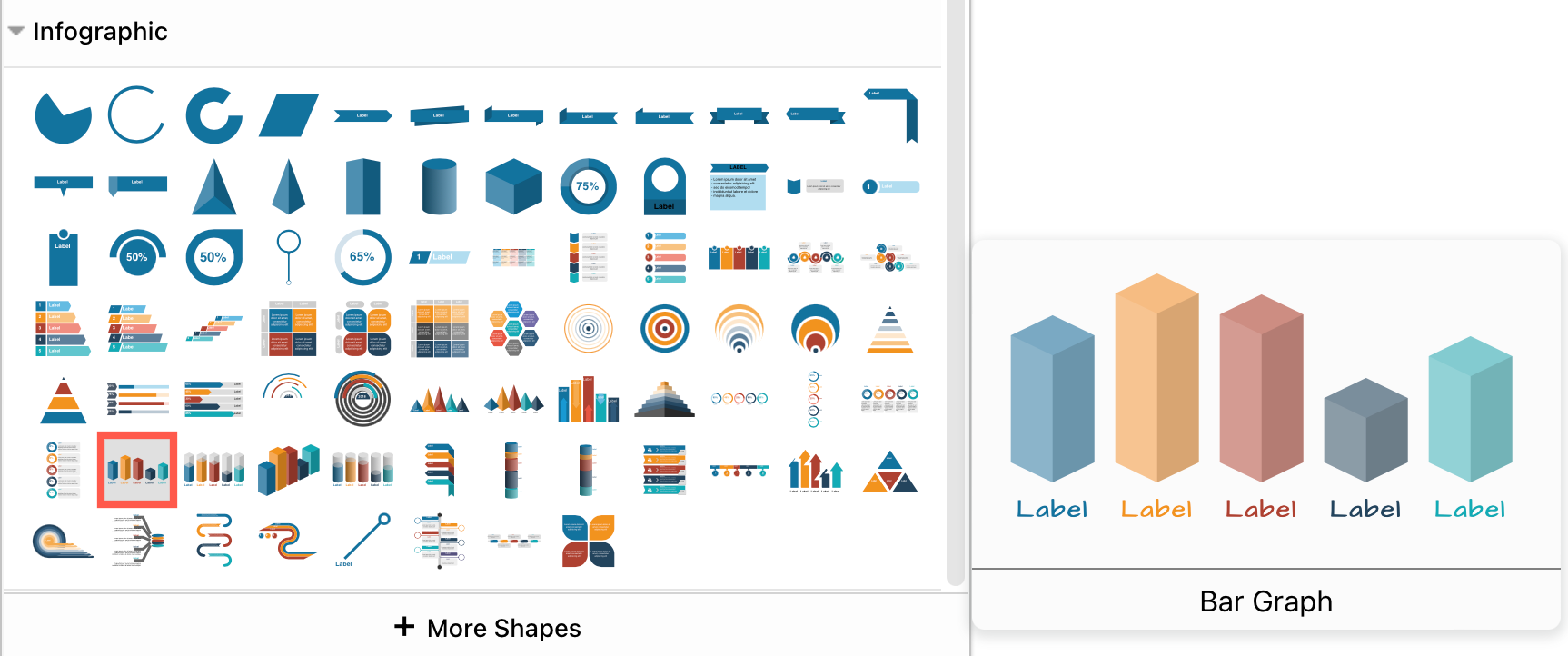
You can create abstract line charts and bar graphs using the Infographic shape library. However, as the draw.io editor is not connected to a form of numerical data input, creating exact graphs from quantitative data is better done in a spreadsheet.
- Click on More Shapes at the bottom of the Shapes panel.
- Enable the checkboxes next to the shape libraries you want to use, and click Apply.