Sankey diagrams
Sankey diagrams were originally designed to visualise loss in a steam engine system. These days, they are also used to illustrate data distributions and flows between states in many types of systems.
Open this example
Sankey diagrams and their related alluvial diagrams and flow maps can visualise:
- Movement of energy, resources, or materials through a system
- Migration flows between different locations
- Budgets and financial modelling
- User journeys through multiple platforms or system states
- Waste visualisations in manufacturing
- Traffic (both physical and digital) over time
- Decisions leading to and from certain states (such as for medical diagnoses)
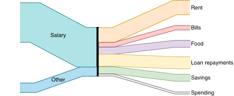
The different stages or states in a Sankey diagram are called nodes, and are often drawn as vertical lines into and out of which the links (connections) flow and split to the next stage.
Open this example
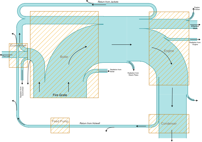
The first Sankey diagram, named after its creator who drew it in 1898, shows the energy flow through an ideal and actual steam engine. He used regions (square boxes) rather than vertical lines to represent each stage.
Open this example
Sankey diagrams in draw.io
If you don't need a value-accurate representation of your system, there are a few ways to draw Sankey diagrams in draw.io. For a Sankey diagram directly from your data, use Mermaid code and insert that into draw.io for an accurate visualisation.
Method 1: Use connectors for curves
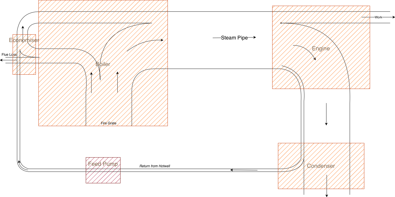
The fastest and perhaps easiest way is to use the partial rectangle shape in the Misc shape library for the horizontal and vertical links.
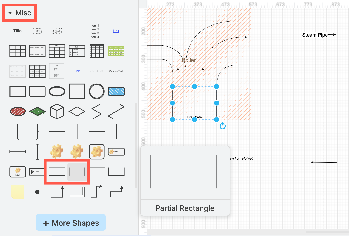
Use curved connectors and attach them to the corners of the partial rectangles.
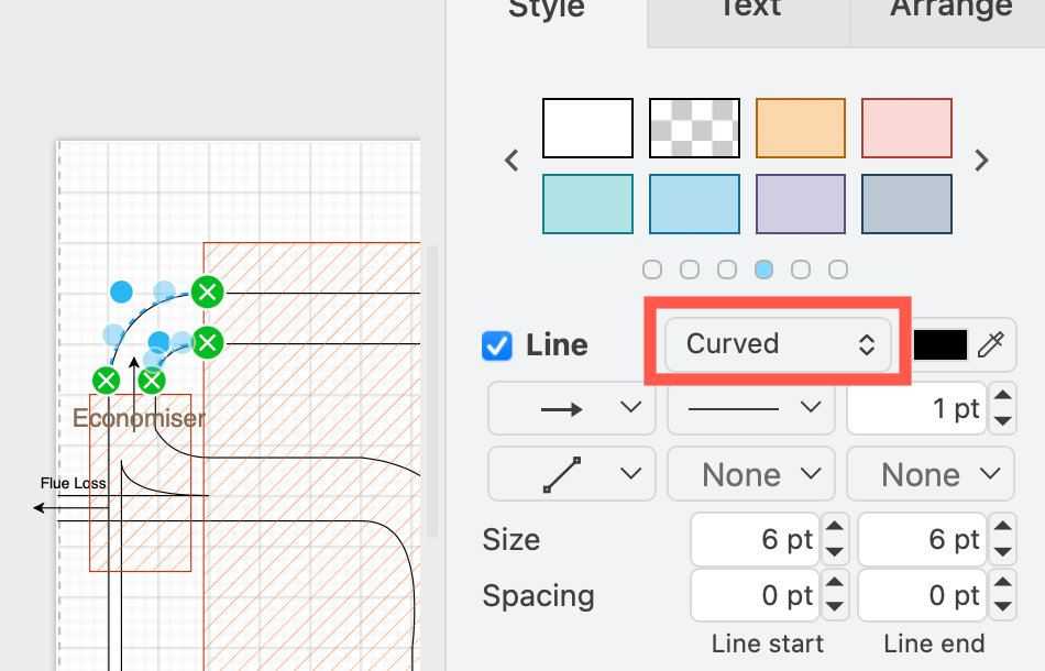
The corners of the partial rectangles perfectly align with the curved connectors, giving your diagram a neat finish.
Use layers for better diagram management
Add directional flow arrows on a separate layer. It makes it much easier to edit and label your diagram when you can lock the layers you aren't working with to prevent any miss-editing.
Place regions on a separate layer on top and use the hatch fill style so you can see the underlying flows of your system clearly.
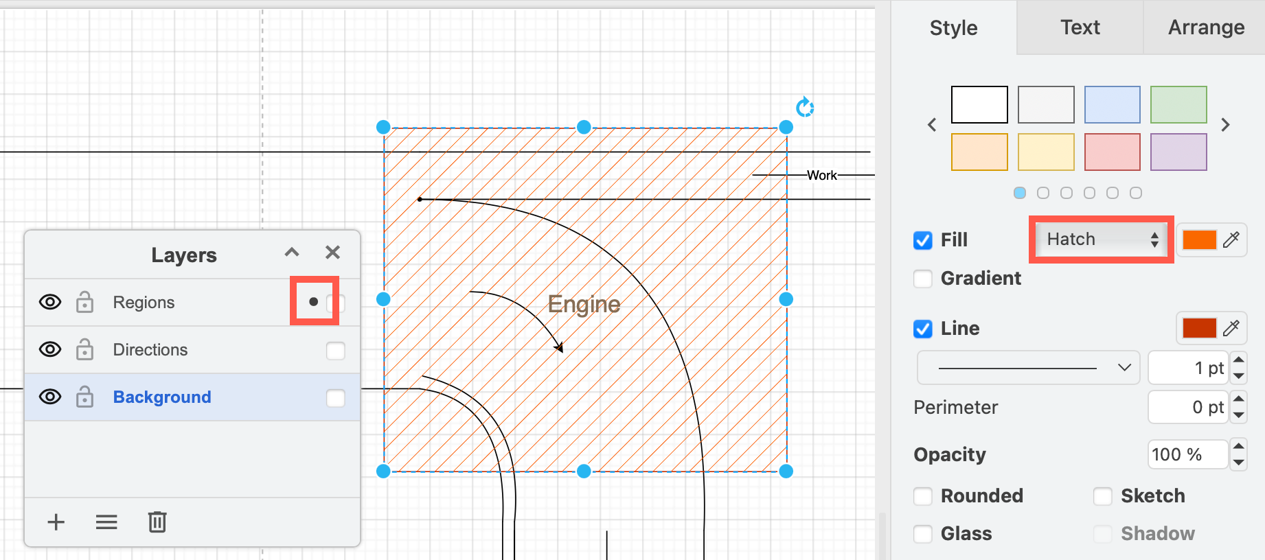
See how to use layers in diagrams
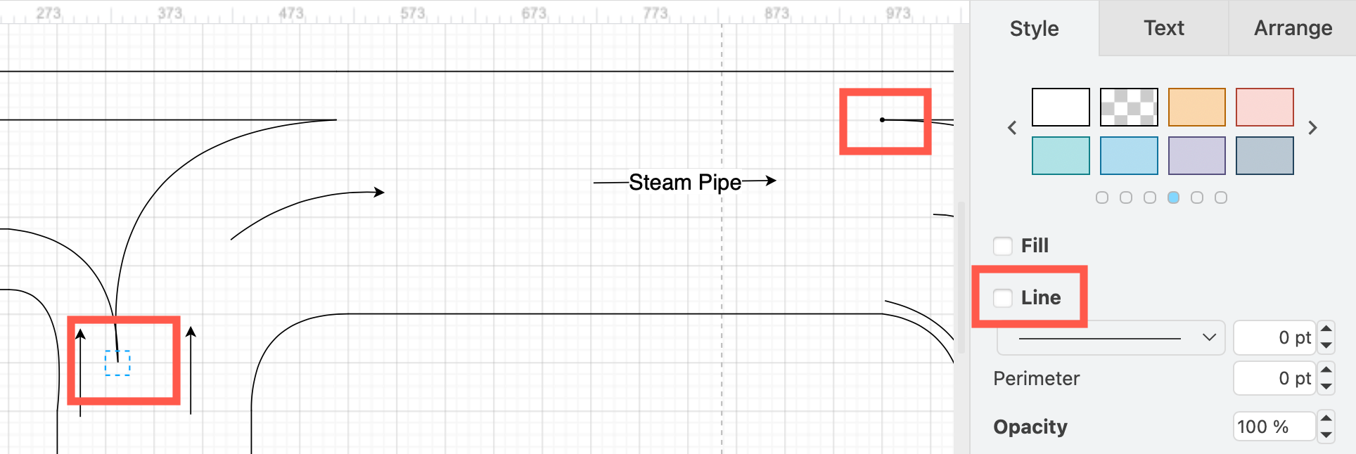
Join connectors with waypoint shapes
Where two curves join, use a waypoint shape to keep them attached. Disable the waypoint shape's Line to turn the shape invisible.
Method 2: Use filled edges for coloured connectors
By using individual connectors to attach the curves to the corners of the partial rectangles, you can't add a fill colour to the entire system - the space between the two connectors on the curves is not a shape and therefore can't be filled.
The filled edge shape from the Misc shape library is routed and attached to shapes as a connector and filled with colour like a shape.
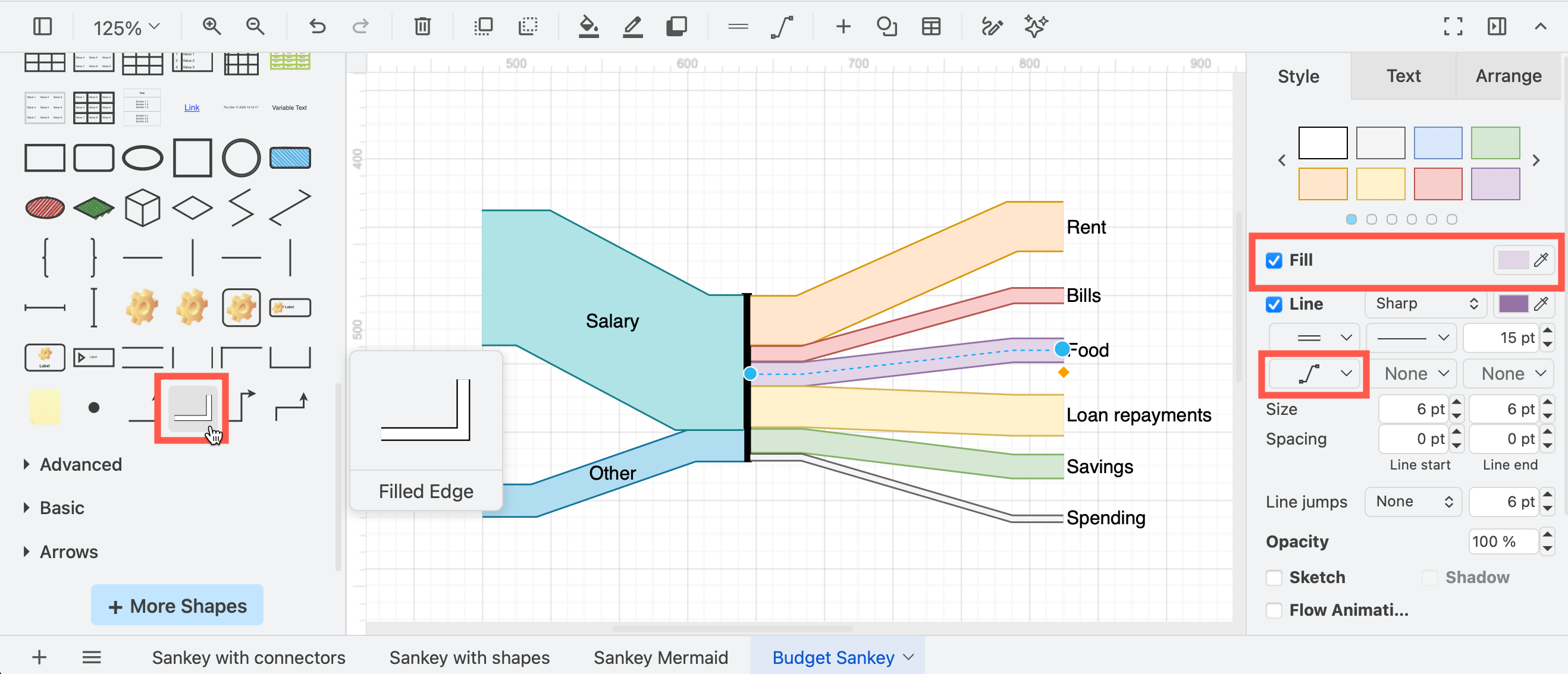
This is an ideal way to create budget flows or similar data-based distribution diagrams.
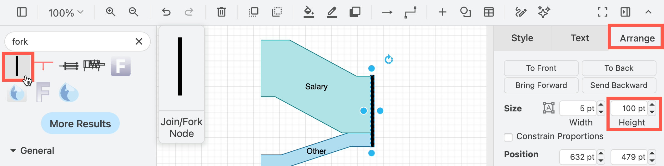
Add a fork/join shape
Add a fork/join shape to the canvas and make it 100 points tall in the Arrange tab of the format panel - enter Fork in the shape search to find the fork shape.
Change the width of the filled edges
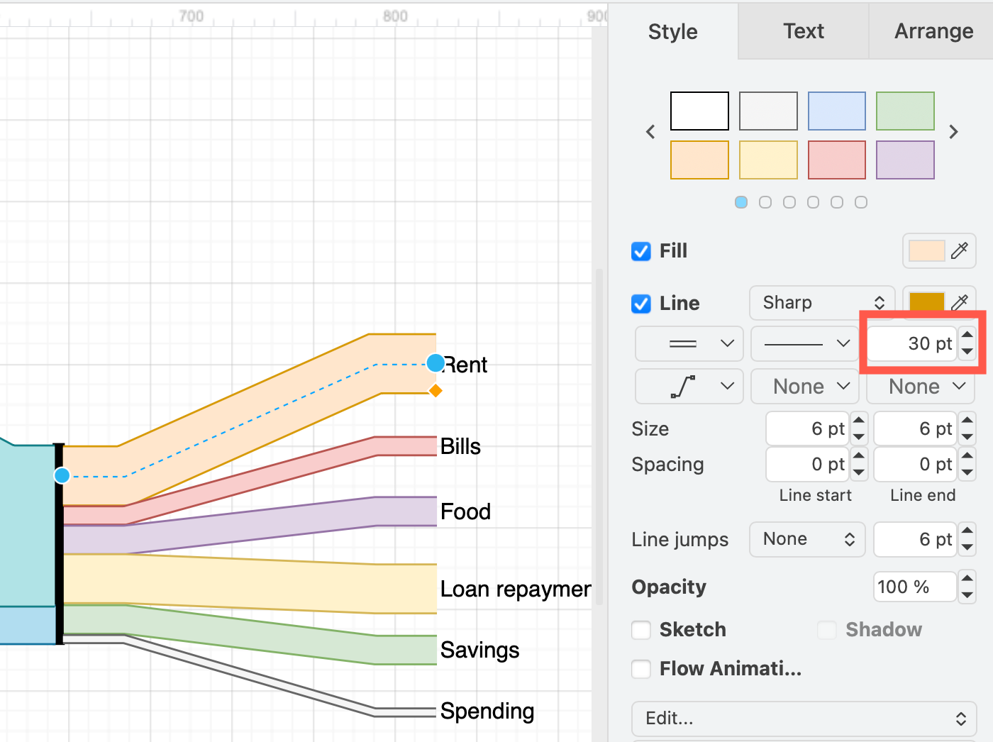
Change the width of each filled edge to be the percentage for each particular category.
Attach the filled edges to the fork
- Attach the connectors to the line or fork shape - they should stack up perfectly to cover the entire length of the 100pt high fork shape.
- Use the Entity Relation connector style to fan out the flows neatly.
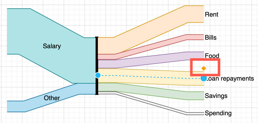
As this is a connector and not a shape, the right/left labels settings do not move the text far from the centre of the connector. Drag the orange diamonds to line each label of the filled edge shapes so they are lined up and easily readable.
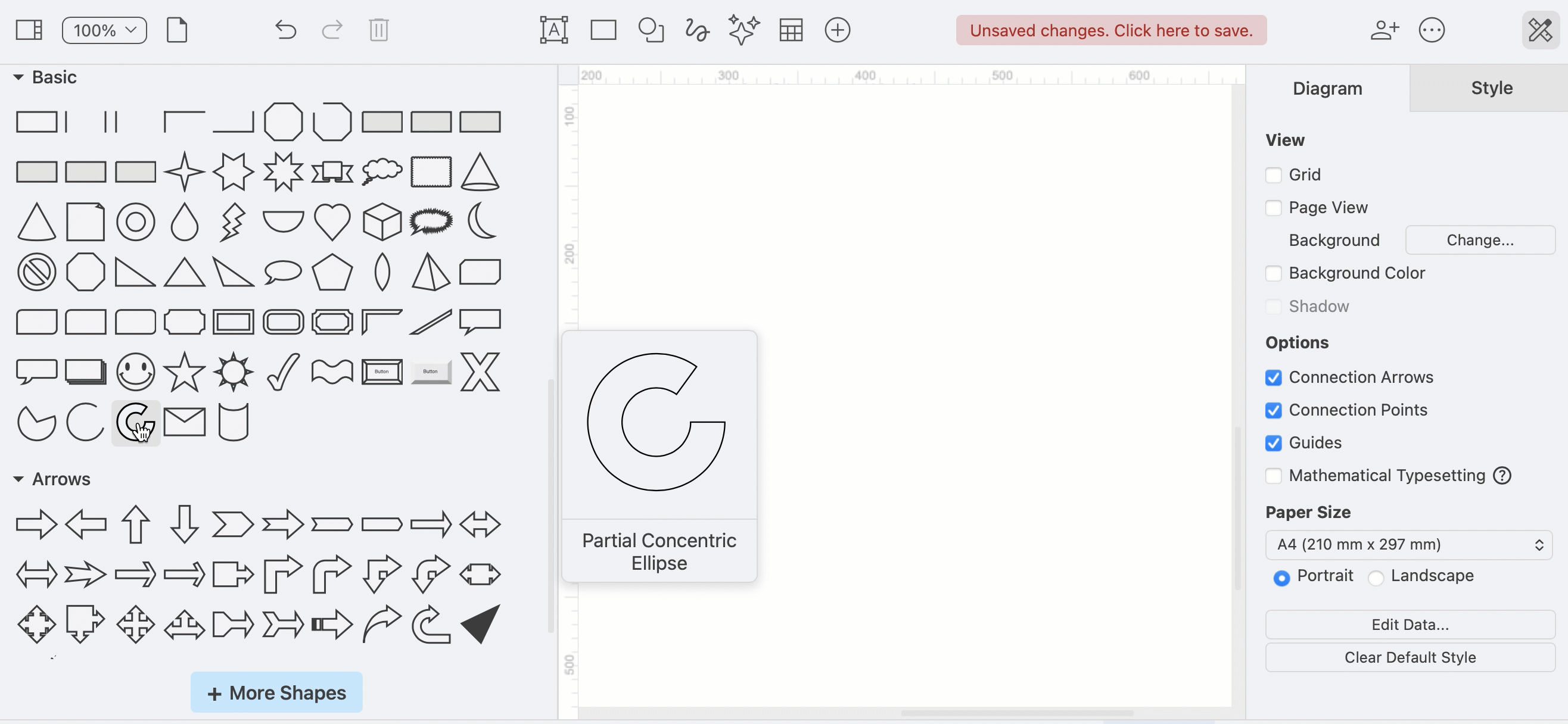
Note: It can be difficult to get the filled edge shapes to line up with the outlines of partial rectangle shapes. If you want to fill your entire system with colours, and filled edges are proving too difficult to use, use partial concentric ellipse or arrow shapes for the curves.
Method 3: Use shapes for curves
In this method, there are no attached connectors - your Sankey diagram will be a collection of shapes drawn right next to each other and positioned just right so it appears to be one flowing system of pipes.
Using arrow shapes
The U-turn arrow and bend arrow shapes from the Arrows shape library are useful for curves. Drag the orange diamonds to remove the arrow heads and turn them into a pipe shape, then use fill colours as you would in any normal shape.
![]()
They do have a minimum width, however, and may not be suitable for small or fine flows.
Using a partial concentric ellipse or arc shape
The partial concentric ellipse shape_ from the Basic shape library is more flexible - drag the orange diamonds to change thickness and arc segment. Rotate to line up with the partial rectangle shapes.
Make sure you enable the Constrain Proportions checkbox in the Arrange tab of the format panel to resize without distorting the arc width.
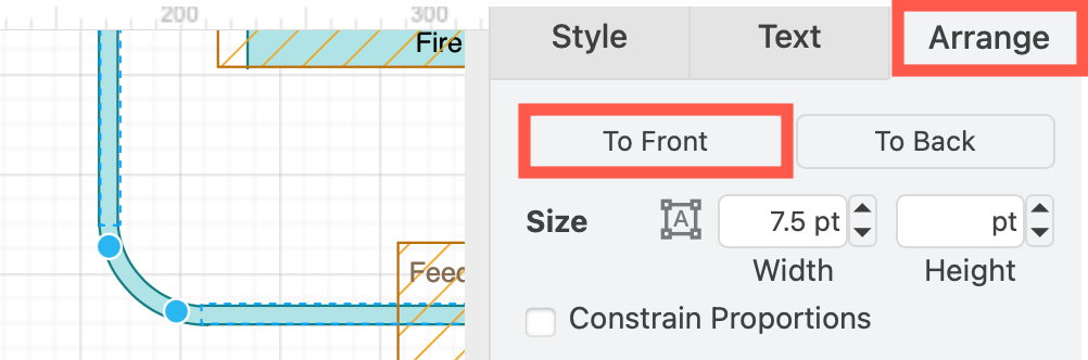
Rotate the shapes so they butt up against or slightly overlap the partial rectangles and bring the partial rectangles to the front via the Arrange tab or right-click context menu to cover the outline and 'connect' the pipes.
With this method, you can add fill colours to enhance your diagram.
- use gradient colours in curves and links to indicate state changes between nodes
- use different colours for different paths
Method 4: Draw Mermaid Sankey diagrams
draw.io is not a data visualisation platform, but it can take the experimental Mermaid descriptions of Sankey diagrams with specific values for each link and convert that code to an SVG diagram.
The example below has been inserted into draw.io from the Mermaid documentation.
- Click Arrange > Insert > Mermaid and add the Mermaid code to the text box.
- Click Insert to add the diagram to the drawing canvas as a SVG shape.
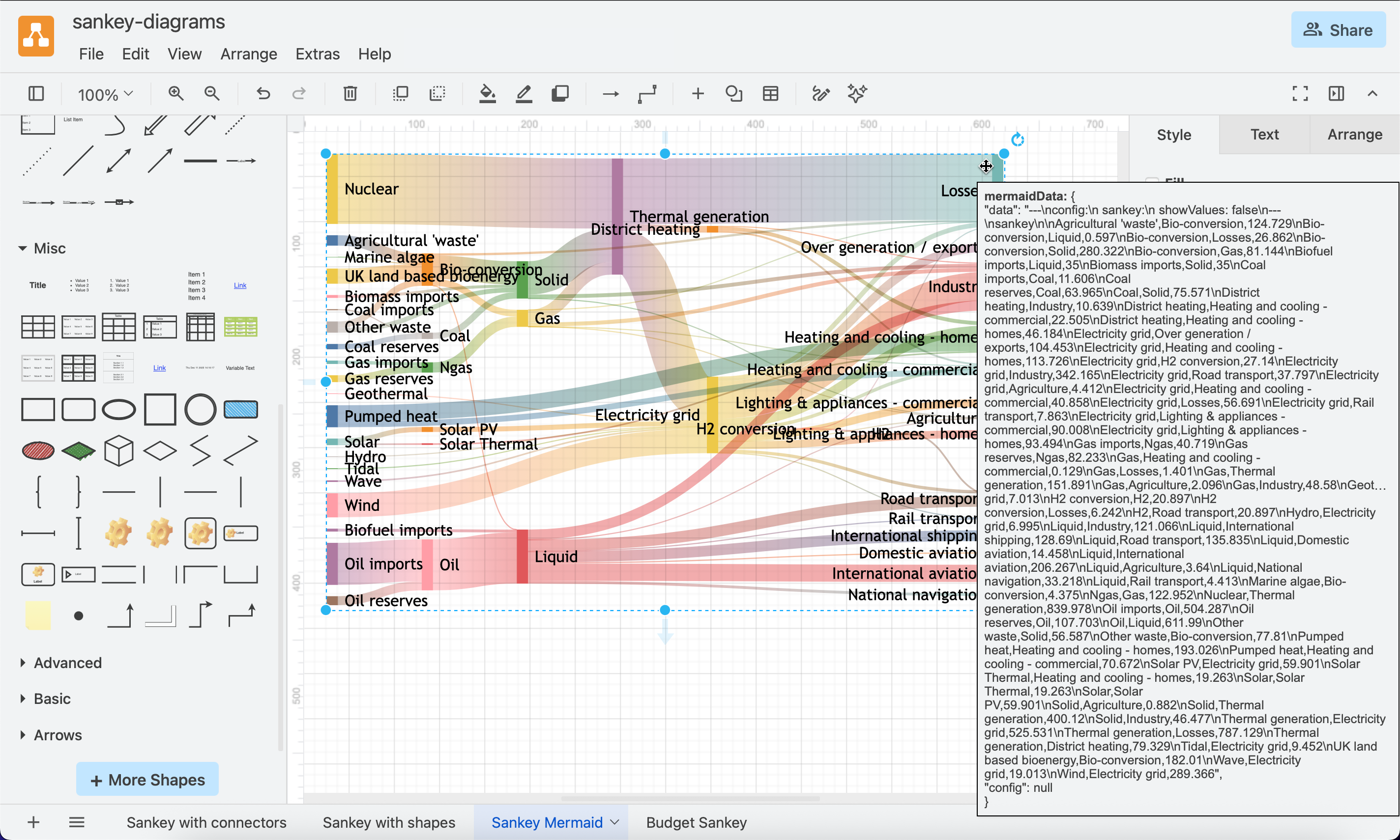
Open this example
draw.io does not convert Mermaid Sankey diagrams to native draw.io shapes. Hover over the diagram to see the Mermaid code and double click on it to edit the code and regenerate the diagram.
Related - Flow maps
Flow maps are similar to Sankey diagrams in that they show the distribution of traffic, such as this old map of Irish railroad traffic, drawn by Henry Harness in 1838.
To create a similar diagram in draw.io:
- Drag and drop an image of the map in a background layer on the drawing canvas and resize it appropriately.
- Lock that layer and create a new one.
- On the new layer, add waypoint shapes at key locations to join or split connectors.
- Then draw the flows with connectors of varying widths.