A history of diagram search terms
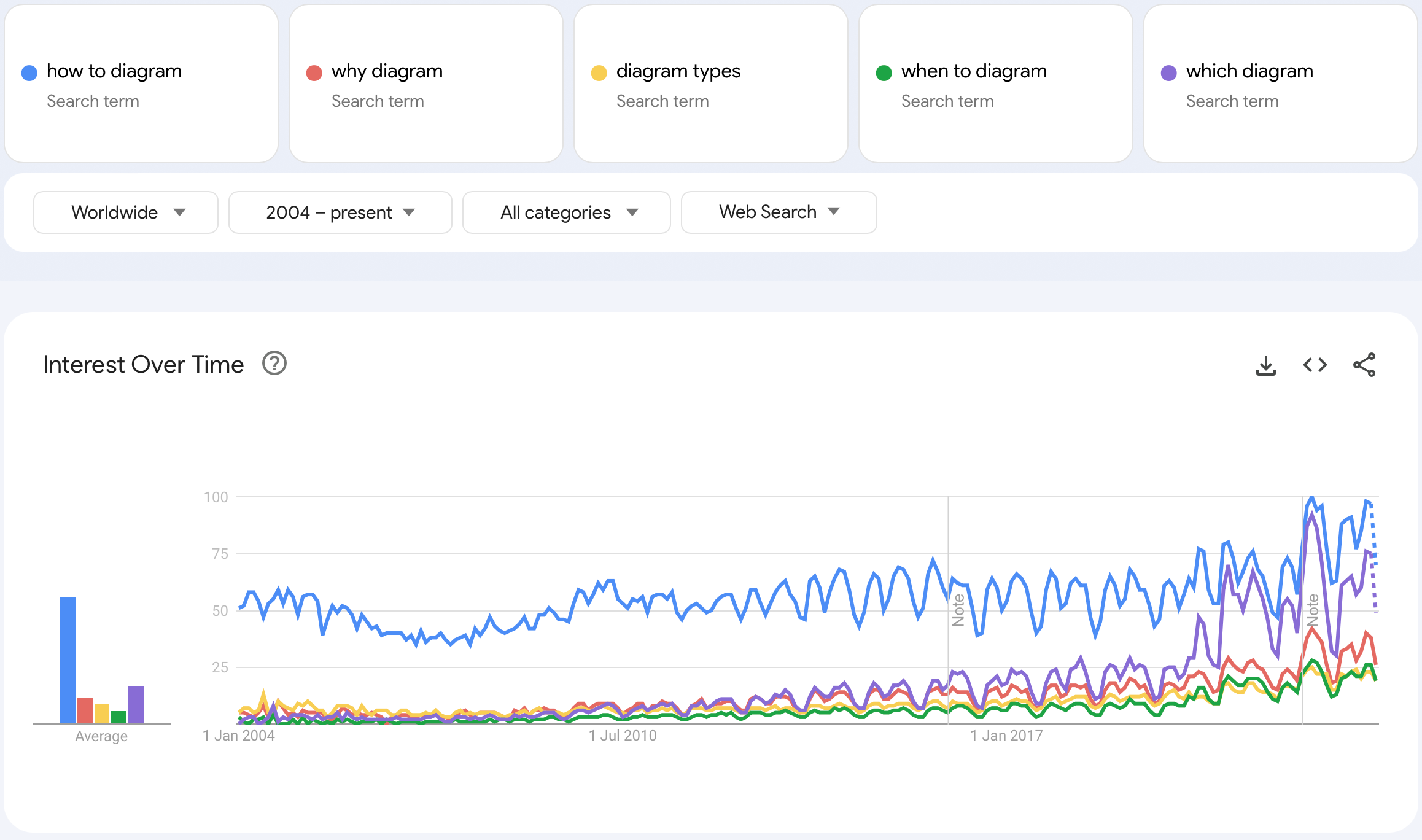
Diagrams are growing in popularity worldwide, and search trends reflect this in interesting ways. By comparing various search phrases in Google Trends, we can see that “how to diagram” has been pretty stable over the past 20 years. But now, people are also searching for which type of diagram to use and when they would be best put to use.
Let’s dig a little deeper into these diagramming search trends.
Flowcharts, mind maps or org charts?
Of the three most popular types of diagrams used in organisations, especially in meetings, which would win out of flowcharts, mind maps or organisation charts?
Unsurprisingly, flowcharts are the most popular - they are used to document processes in all types of industries and teams.
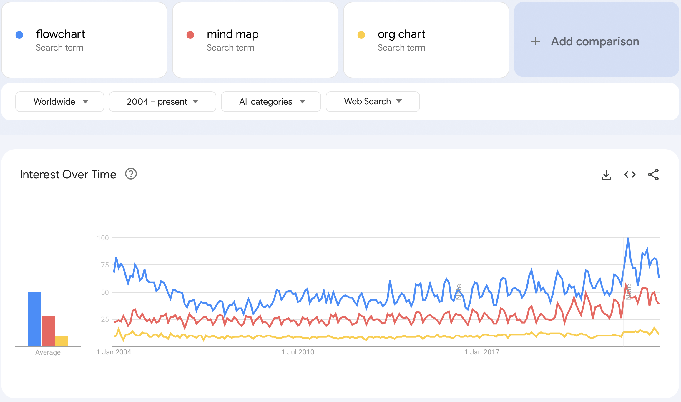
BPMN diagrams, cross-functional flowcharts and swimlane diagrams, dataflow diagrams, gitflows, and value stream maps are more specialised forms of flowcharts, and all searched for at roughly the same rate.
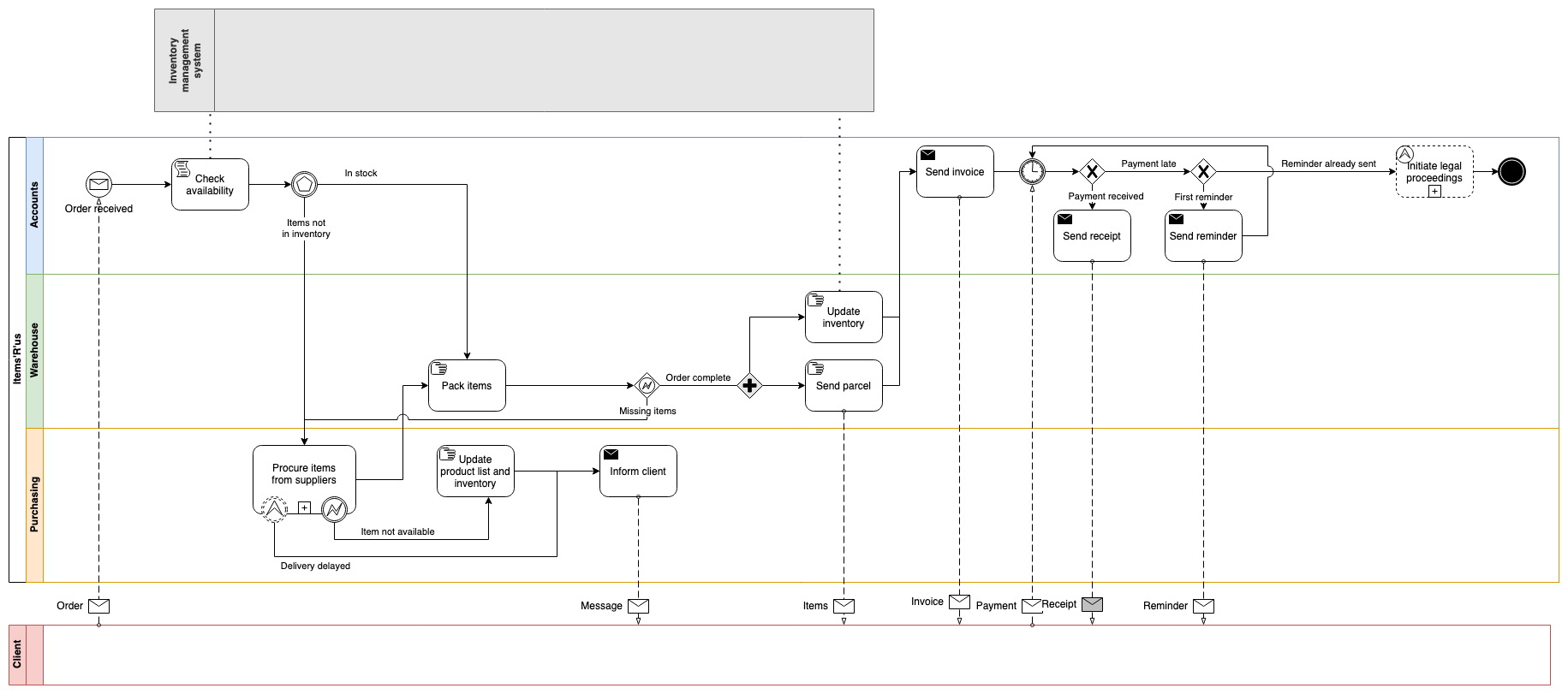
BPMN diagrams are more structured than flowcharts
Which teams diagram the most?
If you work in this field, you’ll not be surprised that IT diagrams are the leading search phrase, much more than business diagrams, marketing diagrams and training diagrams all combined.
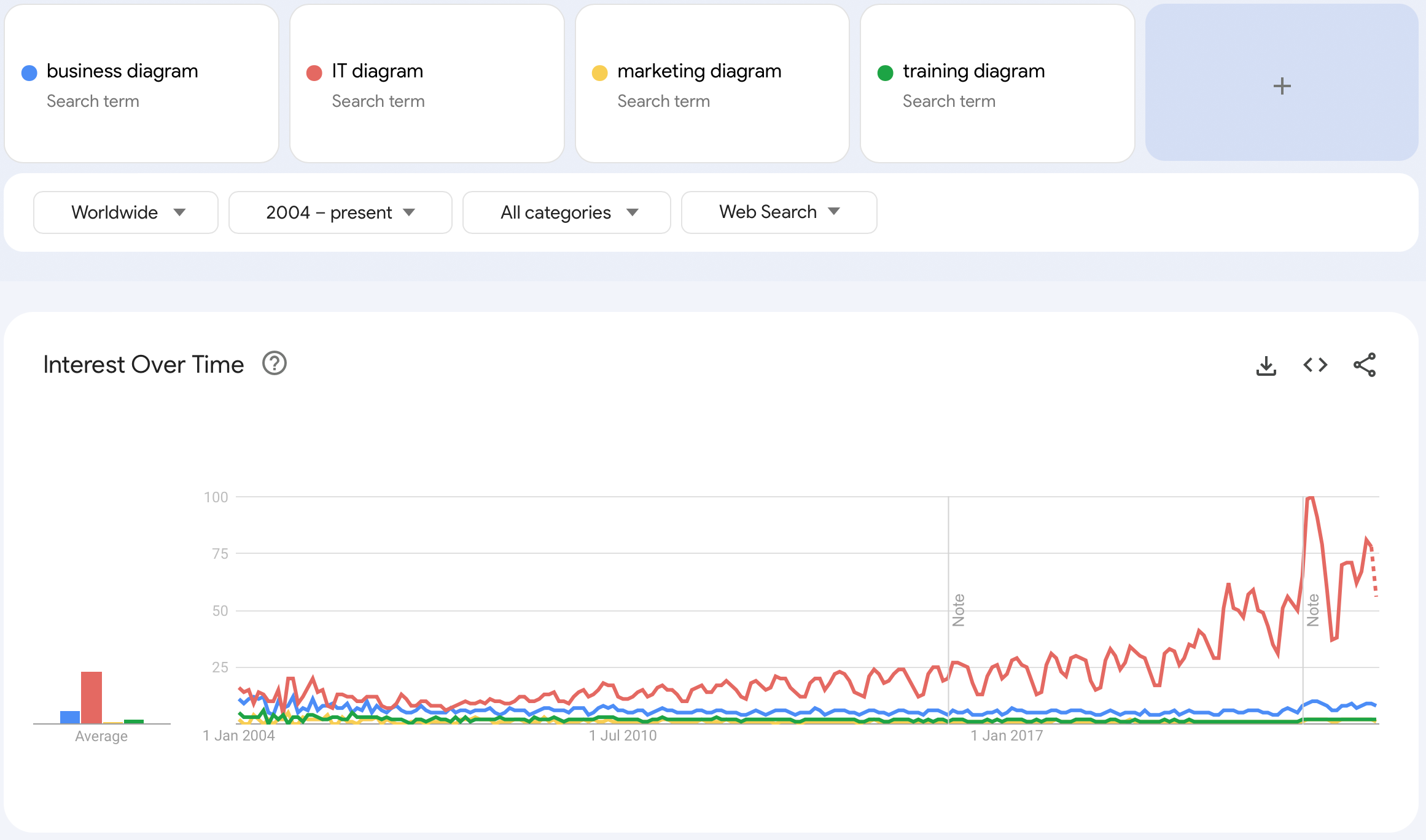
It’s mostly likely because software and technology is increasingly more complex, and therefore easier to document visually in diagrams.
Different types of diagrams in IT
It was a little surprising to see network diagrams decrease in the long term search trend, but perhaps people are now searching more often for cloud infrastructure diagrams. Or perhaps network management tools are automatically documenting their infrastructure for them.
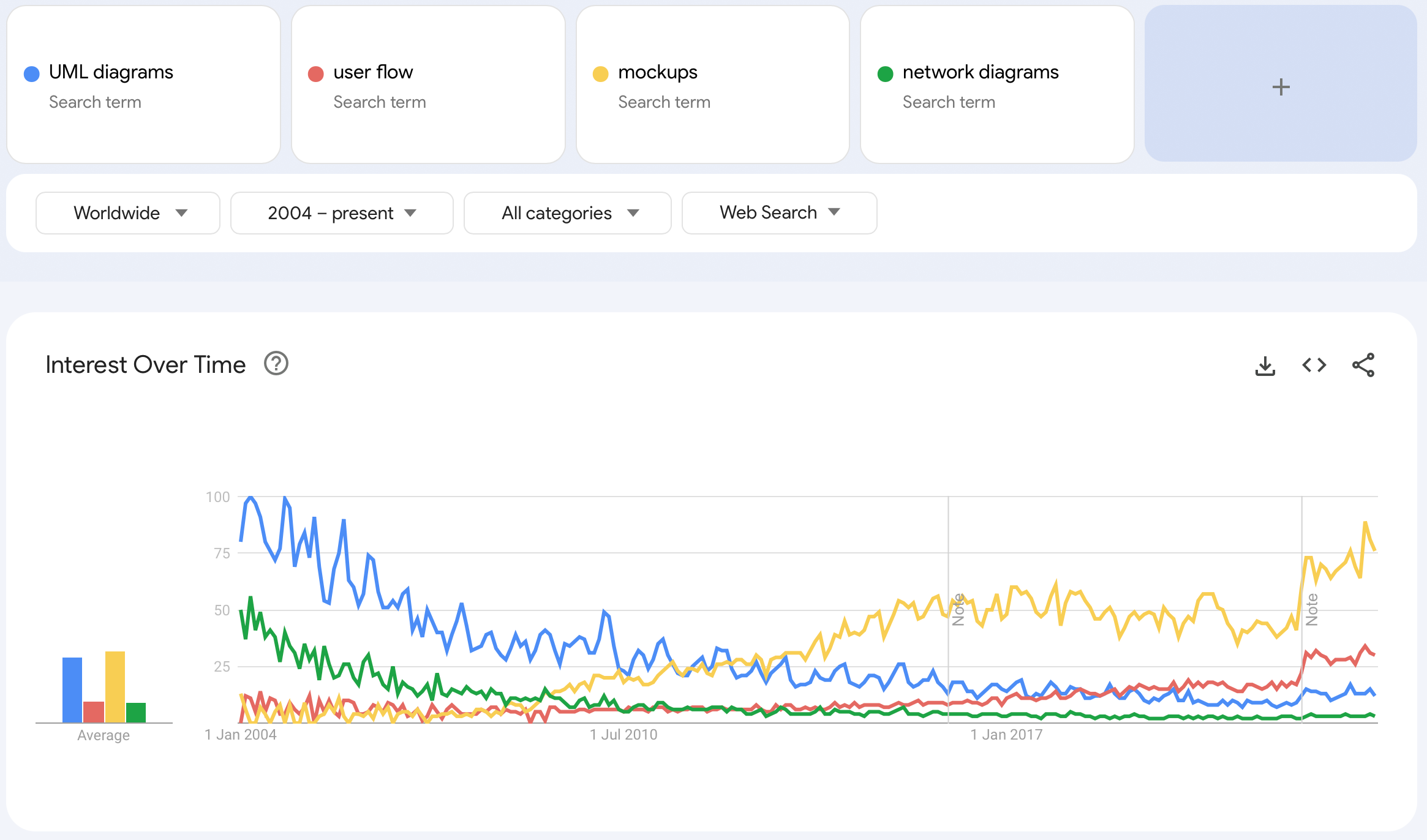
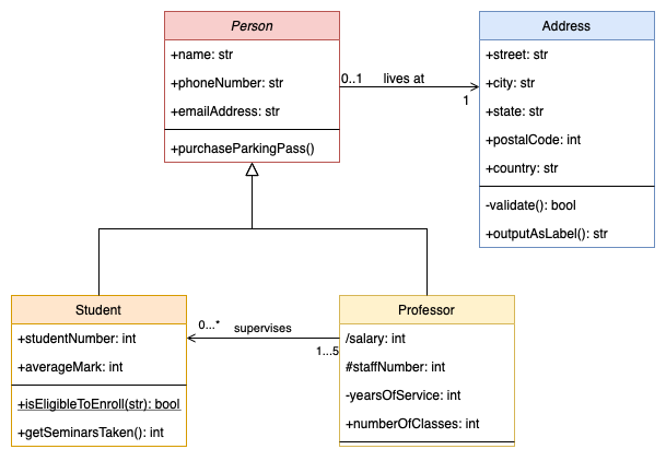
UML diagrams have been losing popularity over time - they can be quite time consuming to draw and maintain for complex software products. When looking at the different types of UML diagrams, class diagrams are still regularly searched for.
Reflecting today’s faster software development and release cycles, the search trends clearly show that mockups and user flows are increasingly popular.
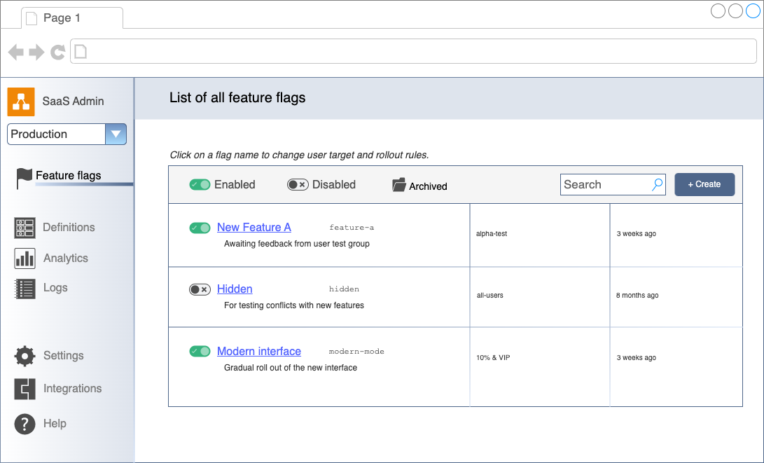
Mockups - like this feature-flag control panel - are easily created in draw.io
Business diagrams for project management
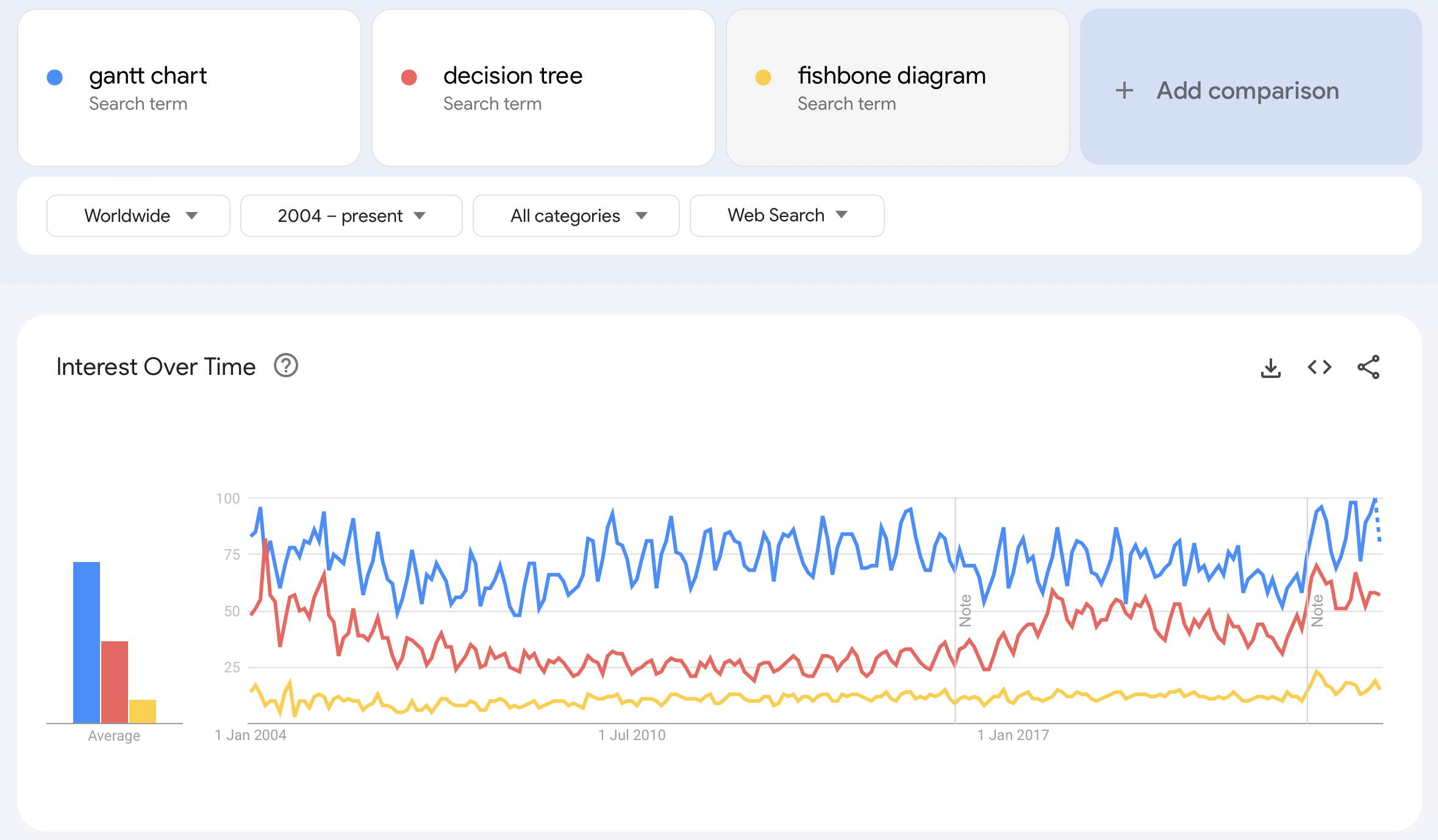
The most popular business diagrams searched for are used to explore and justify business and project management decisions.
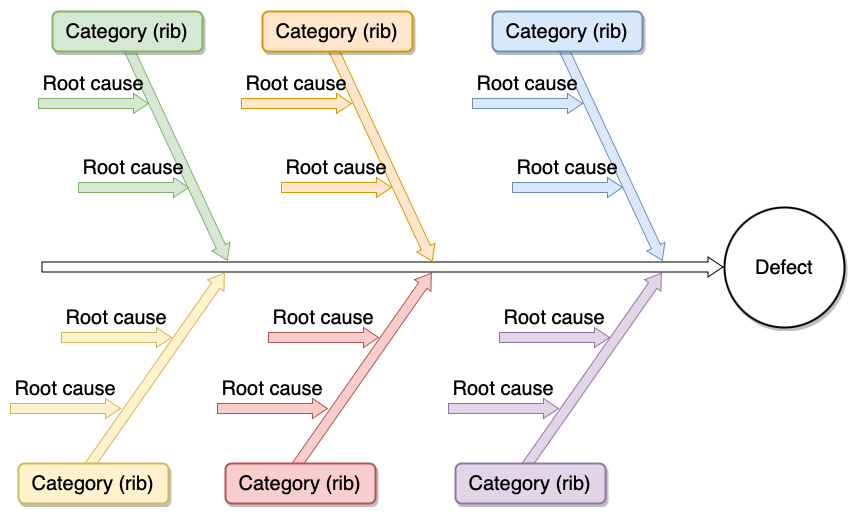
While fishbone diagrams for root cause analyses of problems, have been a constant search phrase over the past twenty years, both decision trees and Gantt charts have seen minor popularity dips. Both popular search terms right now, however.
We’re a little confused - what happened in 2015 to cause the spike in searches for “Venn” diagrams?
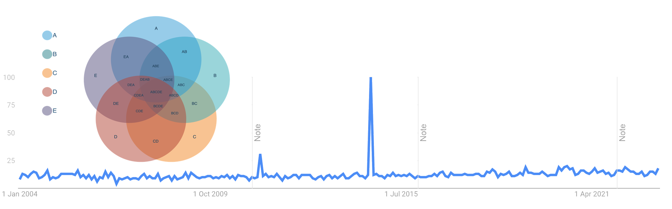
Diagram software, tool or app?
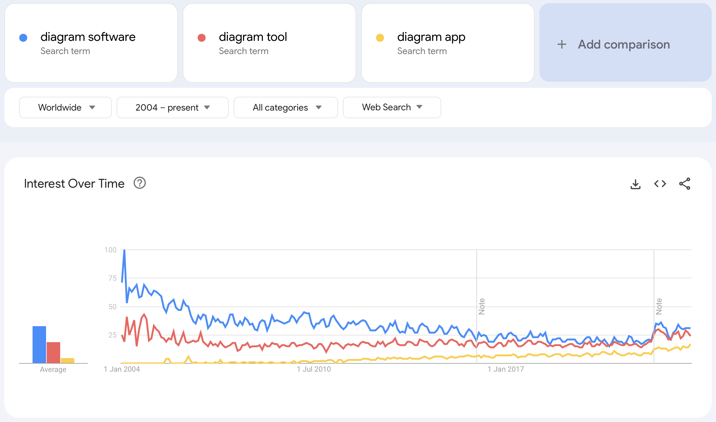
When looking for a way to draw a diagram, do you search for diagram software, diagram tool or diagram app?
These days, app is gaining ground fast, probably because everyone has mobile devices.
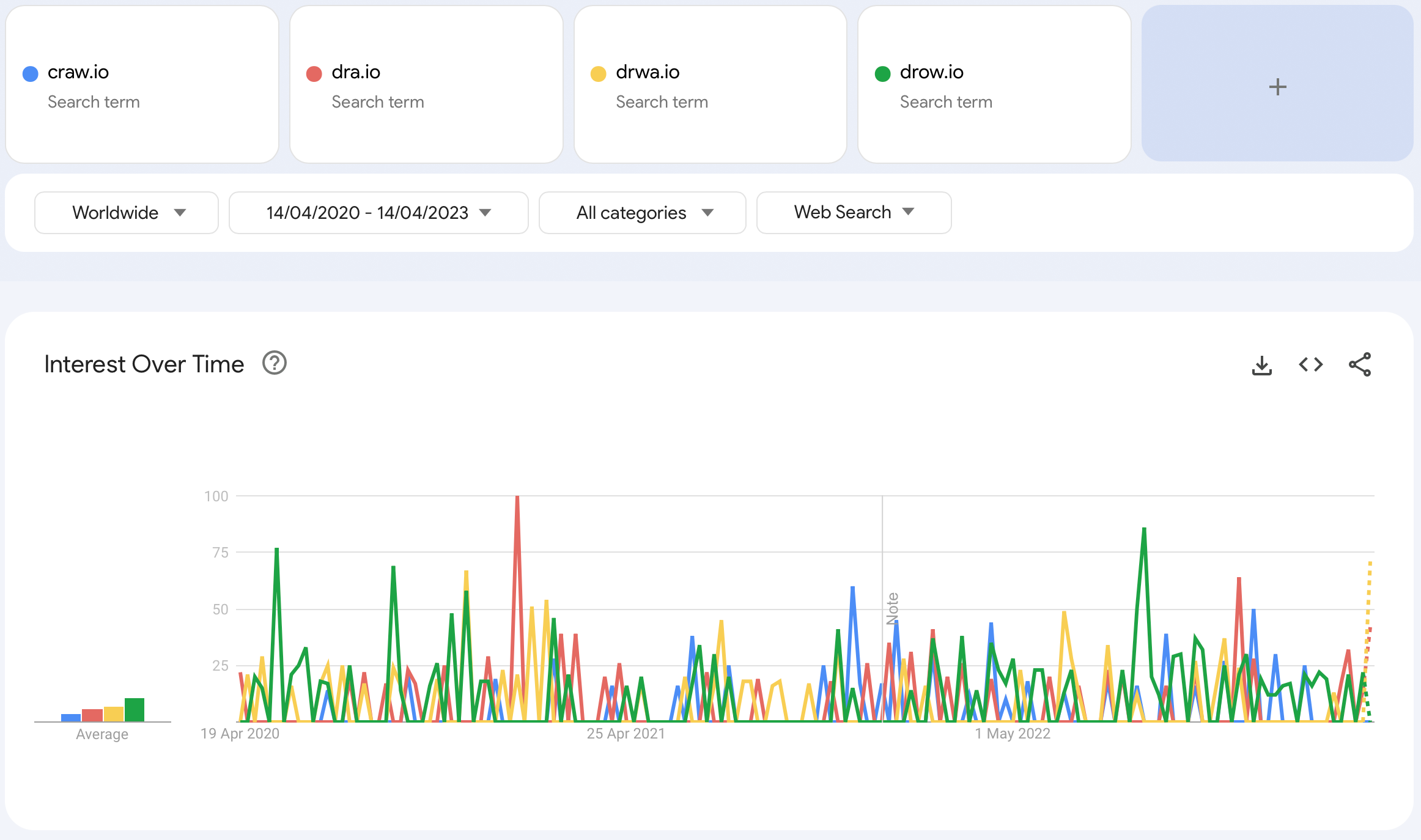
And because we were curious, of the common wrong spellings of draw.io, drow.io has been the most popular in the past three years. Drizzt won’t notice.