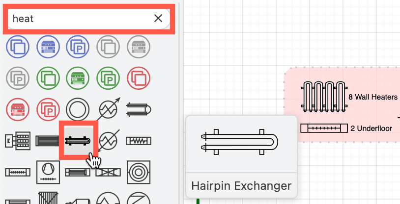
Create custom shapes
You can create your own custom shapes (stencils) in draw.io by describing their geometry, connection points and styles of the components in your shape in an XML format.
Once you have added your custom shape to the drawing canvas, you can drag it into the scratchpad or into a custom shape library if you want to save or share the custom shapes. Click File > New Library to create a new custom library.
General XML structure
The basic draw.io shapes are defined in XML. Click Arrange > Insert > Shape to open the Edit Shape dialog where you can see the XML structure of the shape (stencil). Let's customise this shape to be a large 'L' with a vertical line inside.
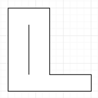
The top level element in the XML must be "shape". So enter:
<shape name="stencilName" h="100" w="50" aspect="variable" strokewidth="inherit">
</shape>
Element attributes
name- shape name.h- height.w- width.aspect- if "variable", you can have any aspect ratio. if "fixed",handware fixed to the ratio you defined in those attributes.strokewidth- "inherit" sets strokewidth to the style you define in the UI. Set it to a positive number and it will be fixed to that width.
Child elements
The shape block can contain three child elements defined in the following order:
<connections>- connection points for connectors (edges).<background>`` - geometry defined here will have shadows.<foreground>- the rest of the geometry.
We will deal with connections later.
Example: Define a background geometry
Let's create the geometry for the background (the outer 'L' part of the custom shape):
<background>
    <path>
      <move x="0" y="0"/>
      <line x="50" y="0"/>
      <line x="50" y="40"/>
      <line x="100" y="40"/>
      <line x="100" y="50"/>
      <line x="0" y="50"/>
      <close/>
    </path>
</background>
The coordinate 0, 0 is always the top left point. The bottom right is w, h, so in this case it's 100, 50.
Now add some foreground geometry (the vertical line inside the 'L'):
<foreground>
    <path>
      <move x="25" y="10"/>
      <line x="25" y="40"/>
    </path>
</foreground>
Every geometry element has to have a defined stroke. It can be stroke, fill or fillstroke. Stroke is stroke without fill, fill is fill without stroke, and fillstroke is both fill and stroke. First, define the foreground geometry (start the foreground element) then define the stroke type in the next line in the XML file.
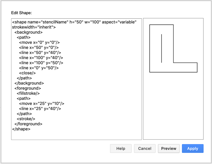
After all this, our shape should be looking something like this:
<shape name="stencilName" h="50" w="100" aspect="variable" strokewidth="inherit">
  <background>
    <path>
      <move x="0" y="0"/>
      <line x="50" y="0"/>
      <line x="50" y="40"/>
      <line x="100" y="40"/>
      <line x="100" y="50"/>
      <line x="0" y="50"/>
      <close/>
    </path>
  </background>
  <foreground>
    <fillstroke/>
    <path>
      <move x="25" y="10"/>
      <line x="25" y="40"/>
    </path>
    <stroke/>
  </foreground>
</shape>
Notice there is no stroke in the background geometry. You don't define it after the background geometry, but instead in the first line of the foreground block.
Click Preview and you should see:
Shape elements
Geometry elements
There are 4 types of geometry elements:
<rect>- attributes"x","y","w","h", all required decimals.<roundrect>- attributes"x","y","w","h", all required decimals. Also"arcsize"is an optional decimal attribute defining how large the corner curves are.<ellipse>- attributes"x","y","w","h", all required decimals.<path>- a general case of geometry, used for more complex shapes.
Path elements
Path is a similar structure as path in an SVG image file. It should start with a <move> where "x" and "y" define the coordinate. After move, an arbitrary number of geometry elements should follow.
Path elements can be:
<move>- to attributes required decimals(x,y).<line>- to attributes required decimals(x,y).<quad>- to required decimals(x2,y2)via control point required decimals(x1,y1).<curve>- to required decimals(x3,y3), via control points required decimals(x1,y1)and(x2,y2).<arc>- this doesn't follow the HTML Canvas signatures, instead it's a copy of the SVG arc command. The SVG specification gives the best description of its behaviours. The attributes are named identically, they are decimals and all required.<close>ends the current subpath and causes an automatic straight line to be drawn from the current point to the last move point of the current subpath.
When the subpath is finished, there are two options. The first is to finish it with </path>, which makes is visually open. The second option is to use <close> and then </path>, which will close the current subpath. A subpath is a segment which starts with a <move> and ends with a <close> or another <move>. A single <path> can contain multiple subpaths, but all of them will use the same style. And if they overlap, the same fill rule applies as for SVG.
The first element of geometry (the background) will use the shadow style if needed, but the rest will not.
Connections elements
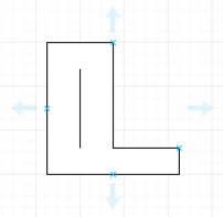
The <connections> element defines the connection points of the custom shape - where connectors (edges) can be attached, shown on hover as green x fixed connection points.
<connections>
    <constraint x="0.5" y="0"/>
    <constraint x="0.5" y="1"/>
    <constraint x="0" y="0.5"/>
    <constraint x="1" y="0.8"/>
</connections>
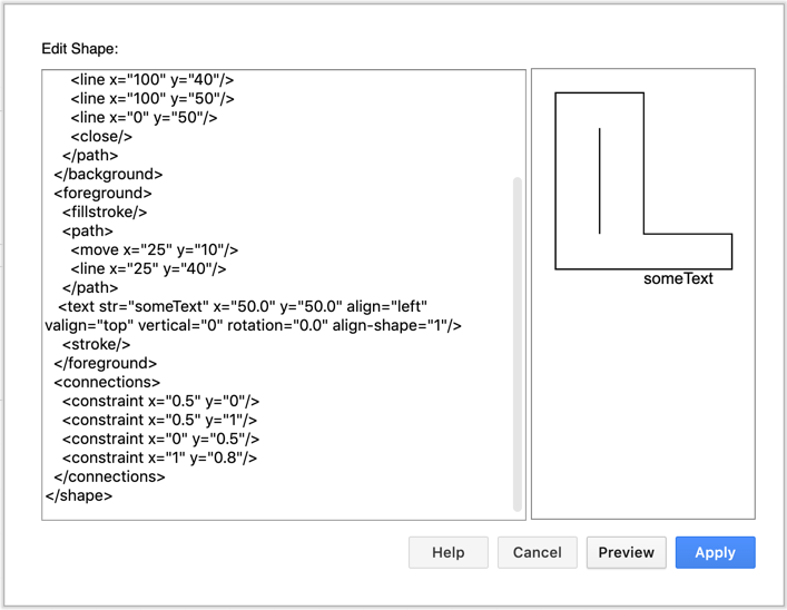
This adds four connection points at the corresponding coordinates. Note the coordinates are relative. x=0 is 0, x=1 is full width. Same for y.
When you hover over the unselected shape, connection points appear as a small x. Drag edges from these connection points or via the blue arrows.
Shape and connector style types
Style functions similar to the SVG style specification. Until you have defined a specific style for that part of the geometry, the default editor style will be in effect and applied to the custom shape.
Style types are:
alpha- defines the alpha level, the opposite of transparency. Attribute is alpha and range is0-1, decimal.0being fully transparent and1being solid.strokewidth- defines the stroke width in pixels. Attributes are width which is decimal and fixed which is optional, default0being scaling with resize and1for a fixed stroke width regardless of scaling. dashed - toggles the dashed line style. Attribute is dashed.0for solid line,1for dashed.dashpattern- defines a custom dashed line style. Attribute is pattern and is an array. The numbers in the array define for how many points there is a line, how many points for a pause, then how many points for a line again, and so on. Imagine the numbers as on/off alternating until the end of the array and then starting over. So<dashpattern pattern="5 1 8 1"/>defines a line length 5, pause of 1, even longer line of 8, another pause of 1 and then starting over.miterlimit- same as in SVG. Attribute is limit, a decimal number. It defines the "edginess" of line joins. The larger the number, the bigger spikes are allowed on sharp joins. The limit attribute defines the cutoff amount for spikes.linejoin- defines the type of line joining. Attribute is join and can be miter, round or bevel, same as in SVG. Default is miter, and it produces straight sharp edges. Round as the name says gives rounded joins. Bevel is the middle solution, as it produces "rounded" joins, but instead a curve, a straight line.linecap- defines the type of line end. Attribute is cap and can be flat, square or round, same as in SVG. Default is flat, and it produces a square edge right at the end of the line. Round as the name says gives rounded ending, after the line end, so the line is a bit longer. Square is the middle solution, as it produces "rounded" ends, but instead a circular curve, with a squared straight line at the end.
There are some more styles that are related to text.
Text elements
Text is added using the text element. You can add text to the foreground or background (before </foreground> or </background>), but be aware that background text may be hidden by foreground elements, especially when those geometries are filled. Text uses the following format:
<text str="someText" x="50.0" y="50.0" align="left" valign="top" vertical="0" rotation="0.0" align-shape="1"/>
Required attributes are str, x and y. Align, valign, localized, vertical, rotation and align-shape are all optional.
str- defines the actual text the stencil will include and is a string. x and y are label coordinates and use a decimal value.align- defines the horizontal alignment and its self-descriptive values are: left, center and right.valign-defines the vertical alignment. Its possible values are top, middle and bottom.vertical-1for text that is rendered vertically,0(default) for horizontal text.rotation- defines the text rotation and is in the range of0.0-360.0.align-shape-1for a text label that rotates with the shape,0for a fixed text label.
The styles related to text are:
fontsize- attribute is size and is a decimal value. Defines font size.fontstyle- attribute is style and is an ORed bit pattern of bold (1), italic (2) and underline (4), i.e. bold underline is"5"fontfamily- attribute is family and is a string defining the type face to be used.
After adding the text to the custom shape as well as its connectors, click Preview.
Using styles
Unless you defined a style inside the custom shape, it will use the default style that is applied to it. In the case of the above example, you can change the fillcolor and strokecolor and it will affect the whole shape.
Let's say we want to keep the behaviour of the outline stroke (it changes as we change the strokecolor in the UI), but we want that vertical line to always be white. Lets call the outline geometry <path1> and the vertical line <path2>. We should do conceptually something like this:
metacode
<path1>
  <fillstroke/>
  <strokecolor color="#ffffff"/>
<path2/>
  <stroke/>
Style stack - save and restore styles
Now assume we have another line we will call <path3> which is declared after <path2> and we want it to have the default stroke color. Since we already defined strokecolor to be white, we need a mechanism to undo this. For this reason the XML format has a stack mechanism. By entering a <save/> element, we save the current style on to the stack. If we use a <restore/> later, we reset the current style to the last save that is in the stack. The stack uses the standard LIFO (last in, first out) structure.
metacode
<save/>               //saving all the styles here, which are unchanged, so the default ones
  <path1>
    <fillstroke/>     //use default fill and stroke
    <strokecolor color="#ffffff"/>
  <path2>
    <stroke/>         //use white stroke, if it was fillstroke, white stroke and default fill color would be used
<restore/>            // we restore the last saved state, which in this case contains the default styles
  <path3>
    <stroke/>         //uses the same stroke color as the first time (the white fill got overwritten in the meantime)
Note: The number of <save/> and <restore/> elements should match.
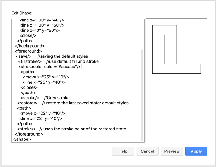
As an example, let's change our 'L' shape to include two lines in the foreground : the first vertical line is grey, and the second one is back to the default stroke colour.
Related
Make a custom shape library
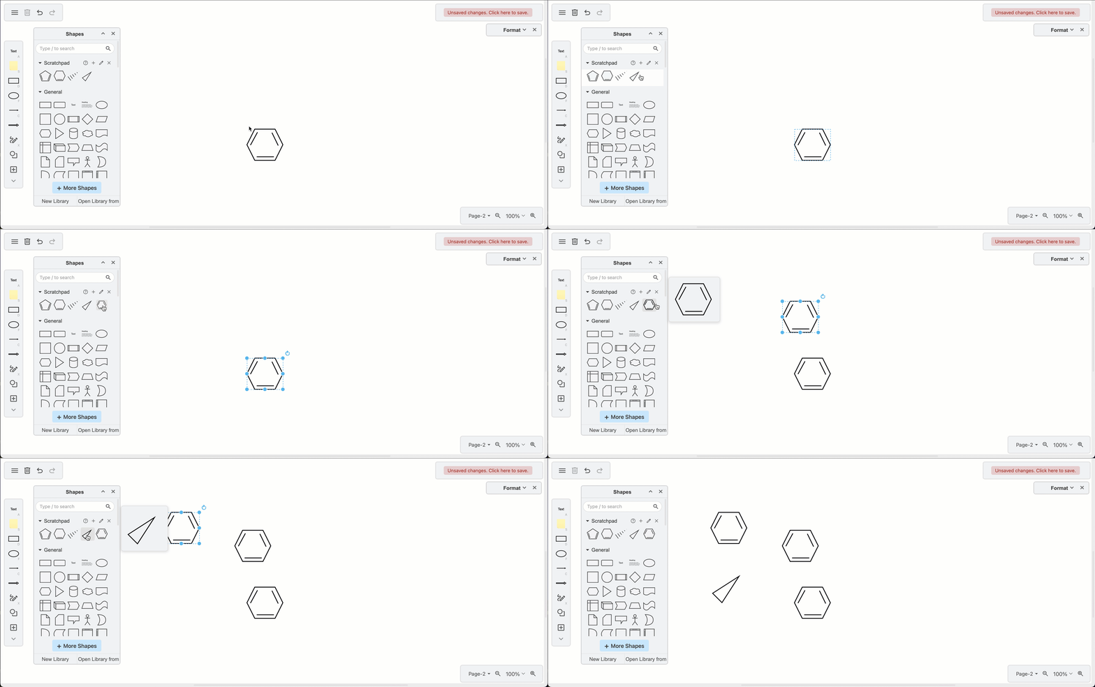
Once you have drawn your custom shape, drag it onto the scratchpad so you can re-use the shape easily. Click on the pencil to edit the scratchpad, and export its contents to a custom shape library.
Build custom shapes from the existing libraries
If you don't want to define the shape geometry in the XML, you can draw freehand shapes, or combine and group shapes from the built-in shape libraries as in the home lab diagram example below.