Venn diagrams
Venn diagrams are widely used in business, education and research to visualise commonalities and differences. Although, you have probably most often seen them used in memes.
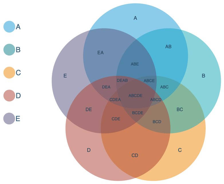
Open this Venn diagram in our diagram viewer
How to read a Venn diagram
One or more circles - usually the same size - are drawn in a Venn diagram to depict groups of things, called sets. Where the sets overlap (intersect) indicates what the sets have in common. The set segments outside the intersection show the differences between the sets. Text or images are added to the various set segments as required.
Occasionally, larger and smaller circles can show the relative sizes of the sets, or ellipse shapes are used to make the text more readable across intersecting segments.
When to use Venn diagrams
You can use Venn diagrams to visualise survey results, disease symptoms, feature lists, behaviour triggers, characteristics, risk factors, group interests or hobbies, opinions held by different groups, course entrance requirements, and more.
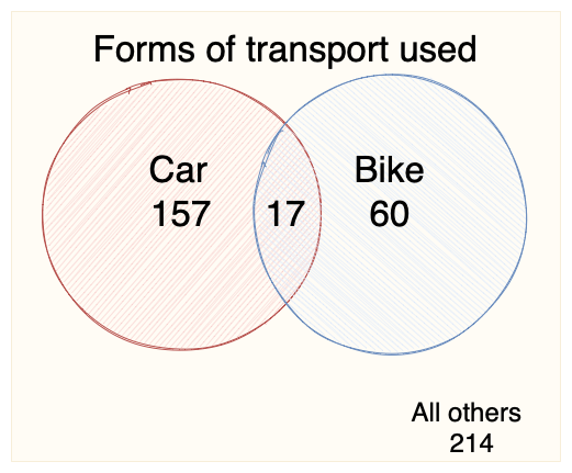
You can visualise any data based on groups (sets) and their characteristics to see what aspects are shared and what aren't, using the basic shapes in our online draw.io editor and our draw.io apps. Alternatively, start with a template from the Venn category.
- Compare two companies in the same industry and show which products are produced by both companies, and which exclusive products each company offers.
- Organise the characteristics or interests of different groups to find your ideal target market or user group.
- Describe the features of competing products. Place the features present in both in the intersection. Highlight the features that are most important bold to help you make a decision on an expensive purchase (like a house or a car).
- Visualise the responsibilities of different teams to reduce confusion when collaborating on projects.
- Split software users into the tasks they will perform with your software to better define which use cases are more important.
- Compare the needs versus desires of different user groups or target markets.
- Show how many people preferred each product or process when surveyed to make better business decisions.
Venn diagram templates in draw.io
- Create a new diagram, or select Arrange > Insert > Template to open the template library.
- Click on the Venn category on the left to see a variety of Venn diagram templates with 3-8 sets. Click on the magnifying glass in the top right of any template to see a larger preview.
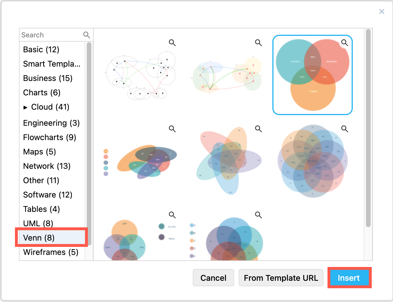
- Select one of the templates, and click Insert (or Create) to add it to the drawing canvas.
- Double click on any text labels to edit it.
More Venn diagram templates are available in our drawio-diagrams GitHub diagram repository.
Draw your own Venn diagram
You can also draw a Venn diagram from scratch using basic shapes.
Add circle or ellipse shapes
Add two or more Circle or Ellipse shapes from the General shape library.
Use the Style tab in the format panel to add colour, reduce the opacity and style the shapes so you can clearly see the overlapping segments.
Add text shapes
As each overlapping segment of a Venn diagram has its own label, you would not use the label on any of the underlying circle shapes. Instead, on top of each of the segments, add one or more text shapes.
In the General shape library, drag Text shapes into good positions on the set circles and intersections. Use the blue guidelines that will appear automatically to fine-tune the text placement, or list multiple characteristics in each segment.
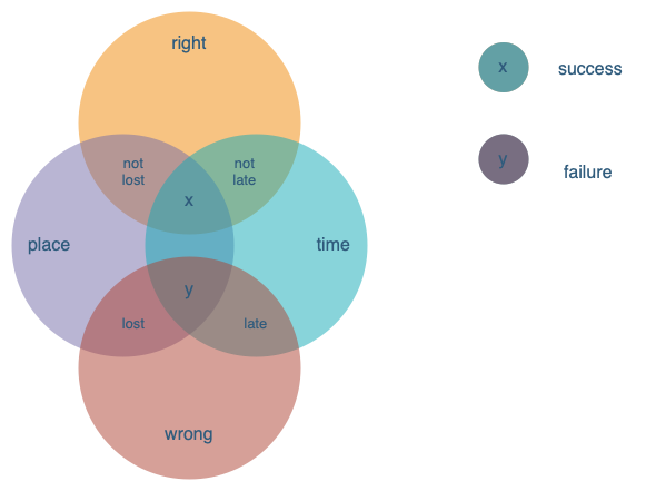
Open this Venn diagram in our diagram viewer
Tips:
- Move the underlying circles to the back, behind the text via the Arrange tab on the format panel.
- Alternatively, use layers in your diagram, and place the circles on a background layer, and the segment labels on a layer above it.
Euler diagrams versus Venn diagrams
Venn diagrams were popularised by the mathematician John Venn around 1881. He didn't invent them, but instead tweaked the concept of Euler diagrams (1700s).
While both Venn and Euler are types of set diagrams, to be technically correct, Venn diagrams must show all possible logical relationships between a number of sets, where each set must overlap all other sets. This is not followed in practice, however.
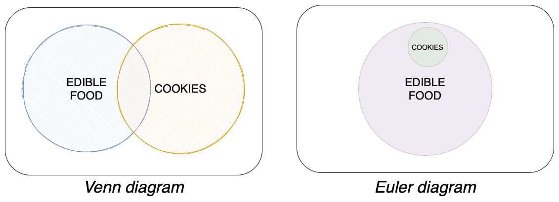
Euler diagrams show any relevant relationships, including sets that don't have anything in common and don't overlap, and subsets that are fully inside another set.
As an example, the diagram below shows the sets edible food and cookies.
A Venn diagram should show all three set segments - edible food that isn't a cookie, cookies that are edible food (intersection), and cookies that aren't edible food. The Euler diagram simply places the cookies as a subset inside the edible food set.
You'll find that the terms Venn diagrams, Euler diagrams, set diagrams, and logic diagrams, all refer to this type of diagram, and are usually used interchangeably.
Related
Venn diagrams are closely related to T-charts, another diagram commonly used in education to compare and contrast two categories of things.