use cases
Four ways to draw Sankey diagrams in draw.io
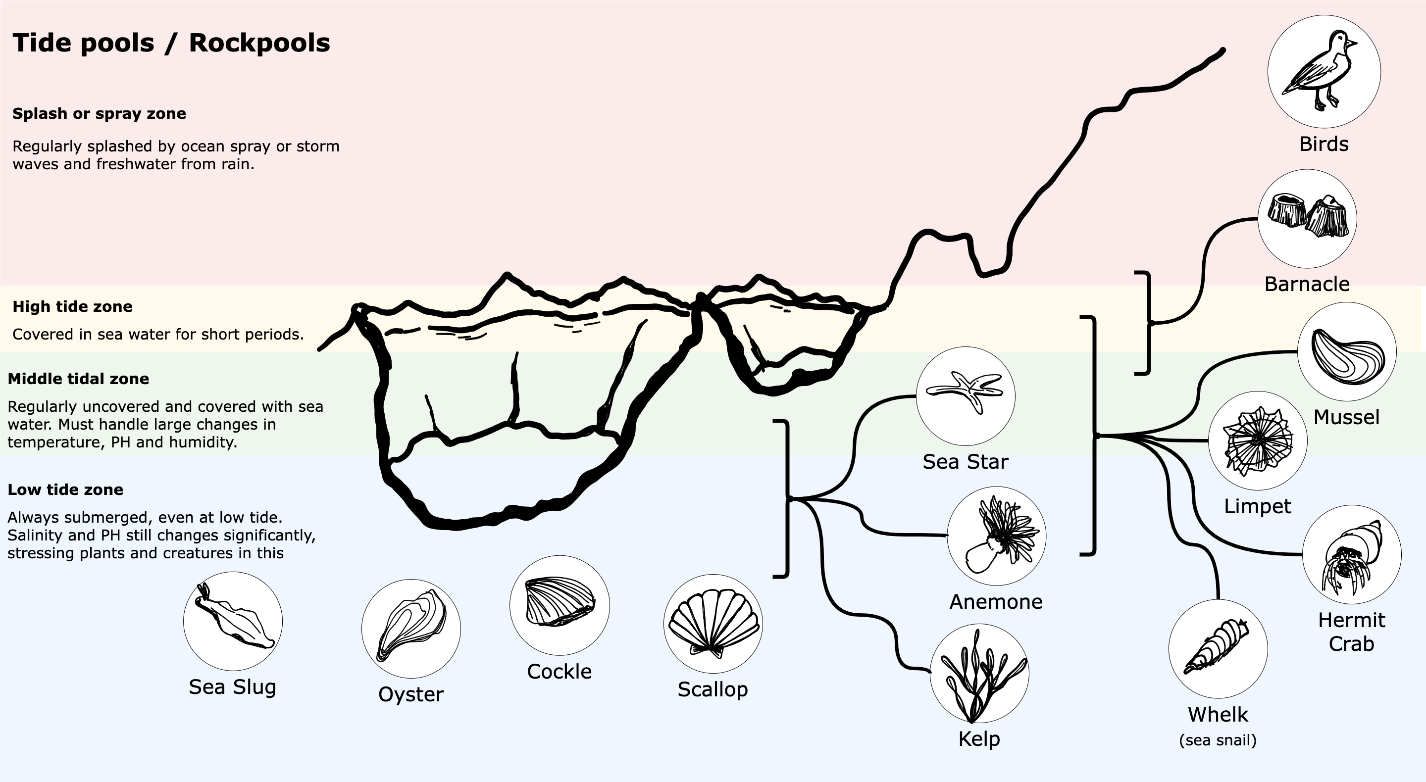
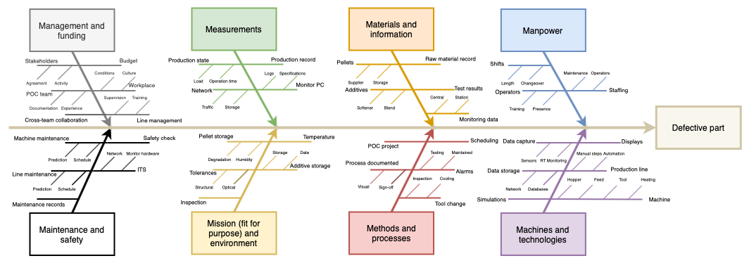
Sankey diagrams were originally designed to visualise loss in a steam engine system. These days, they are also used to illustrate data distributions and flows between states in many types of systems.

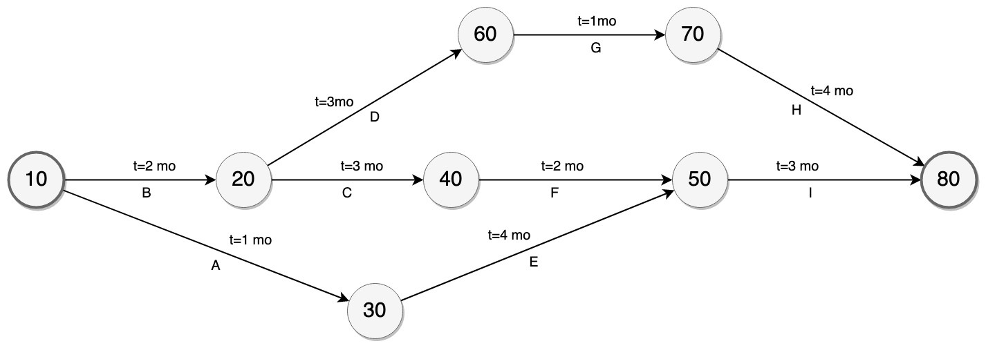
Open this example
11 Dec 2025