Animations and Custom Actions
draw.io has two related features for building interactive diagrams:
- Animations play a sequence of effects (fade-in, wipe, flow, etc.) attached to a page. They start automatically when the diagram is opened in chromeless / lightbox mode.
- Custom actions attach a sequence of effects to a cell's link. They fire when the user clicks the cell.
Both features share the same effect catalogue and the same selector model (cells, tags, layers, exclude). This document covers both editors.
Note: Custom actions are not available in draw.io for Confluence Server.
Opening the editors
| Editor | How to open |
|---|---|
| Animation | Menu → File > Page Setup → click the Edit button next to Lightbox Animation (edits the page-level animation). |
| Custom action | Right-click a cell → Edit Link… (or select the cell and press Alt+Shift+L) → pick the Action radio → Edit…. |
Both editors are non-modal draggable windows so you can keep editing while selecting cells in the canvas. They snap to viewport edges if you drag them near a corner.
Advanced users can switch to the raw JSON view via the Edit Text checkbox at the top of the dialog — useful when you want to paste an existing custom-action snippet or hand-edit fields the visual editor doesn't expose (like transient: false — see the Legacy section).
Finding cell, page, and layer IDs
Several actions target cells, pages, or layers by ID. To find an ID:
- Shape: Right-click on the shape and select Edit Data, or select the shape and press
Ctrl+M(Windows) /Cmd+M(macOS).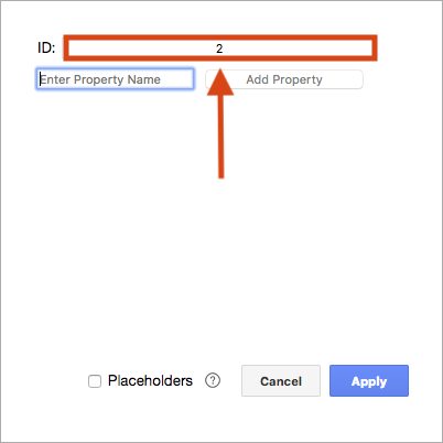
- Page: Make sure nothing is selected, then press
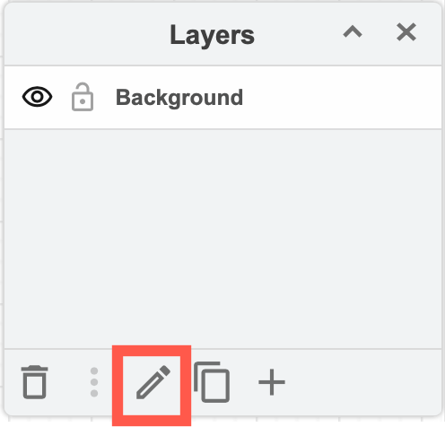
Ctrl+M/Cmd+Mto see the current page's ID. - Layer: Open the Layers dialog (View > Layers), select the layer, open the layer menu (three horizontal lines) and pick Current Layer > Edit Data.
Selectors
Every step / action targets a set of cells using four fields, displayed as up to four chips:
Cells (N cells)
Explicit list of cell IDs. The chip click opens a menu:
- Use selected cells — replace the list with the current canvas selection. Disabled when the canvas has no selection (updates live while the popover is open).
- All cells — toggles the wildcard
*. When active, the action targets every cell in the model. Your previous explicit IDs are stashed and restored if you toggle wildcard off again. - Select cells in diagram — highlights this exact set on the canvas, so you can see what will be affected.
- Reset — clears the field.
- Select layers — opens the layer picker so you can pick whole layers as the target. Once any layer is picked, the Layers chip appears next to Cells.
- Select by tags — opens the tag-cloud popover so you can pick existing diagram tags. Once tags are selected, the Tags chip appears next to Cells.
- Exclude selected cells — appends the current canvas selection to the action's exclude list (deduped). Once anything is excluded, the Exclude chip appears next to Tags. Disabled when nothing's selected.
Layers (N Layers)
Layer-based selection. The Layers chip is hidden by default and only appears once an action has ≥1 layer picked. To seed it, use Select layers in the Cells chip's menu — that opens the layer picker anchored to the Cells chip; when you toggle layers in the checkbox list, the Layers chip materialises next to Cells. From then on the Layers chip is the primary entry point for editing.
The layer picker:
- Every top-level layer in the diagram appears as a row with a checkbox. Layer rows are listed in their model order; the first unnamed layer shows as Background.
- Toggling a row immediately updates the selection.
- Select cells in diagram — selects every descendant cell of the picked layers on the canvas (disabled when no layers are picked).
- Reset — clears all selected layers. When the chip is empty after a reset, it disappears again on the next render.
- Layer membership is resolved at runtime — cells added to a layer later are automatically included next time the action runs.
Tags (N Tags)
Tag-based selection. The Tags chip is hidden by default and only appears once an action has ≥1 tag picked. To seed it, use Select by tags in the Cells chip's menu — that opens the tag-cloud popover anchored to the Cells chip; when you close the popover with tags picked, the Tags chip materialises next to Cells. From then on the Tags chip is the primary entry point for editing.
The tag-cloud popover:
- Every tag that exists in the diagram appears as a clickable pill. Green = selected, gray = not selected.
- Match: All / Any at the top toggles the rule:
- All (AND) — cell must have every selected tag (default).
- Any (OR) — cell must have at least one selected tag.
- Select cells in diagram — highlights every cell matching the current rule on the canvas (disabled when no tags are picked).
- Reset — clears all selected tags. When the chip is empty after a reset, it disappears again on the next render.
- Click the chip again while the popover is open to dismiss it. Clicking anywhere on the canvas (cell or empty area) keeps the popover open so you can pick cells without losing the popover.
Exclude (N excluded)
Explicit list of cell IDs to remove from the result of cells ∪ layers ∪ tags. Same chip behaviour as Cells, no wildcard. The exclude is applied as the final step, so cells: ["*"], excluded: ["cellA"] means "everything except cellA".
The Exclude chip is hidden by default and only appears when the action has ≥1 excluded cell. Add cells to the exclude list via the Exclude selected cells entry in the Cells chip's menu, then the chip becomes visible. Resetting it (chip → Reset) hides the chip again.
Effect catalogue
These are available in both the animation step picker and the custom action picker. Each carries the four selector chips above (except wait, open, viewbox, and tags, which don't target cells). The picker groups them as Visibility / Effects / Style / Navigation / Tags / Timing.
Every effect is transient by default. Clicking a custom action — or playing an animation step — only changes what the current viewer sees in their browser. Nothing is recorded on the undo stack, nothing is synced to other people viewing the same diagram, and nothing is saved to the file. A page refresh restores the diagram to its original state. This makes both features safe to use as presentation overlays on shared diagrams: the canonical version is never altered just because someone clicked a link or watched an animation play.
A small number of legacy effects (Show, Hide, Toggle, Set Style, Toggle Style) used to mutate the model. You can still opt into that behaviour for those specific effects via a JSON-only transient: false flag — see the Legacy: persistent actions section at the bottom.
Visibility
| Effect | Behaviour |
|---|---|
| Show | Sets the cell's SVG opacity to 1 (paints it visible on the current viewer). |
| Hide | Sets the cell's SVG opacity to 0 (paints it invisible on the current viewer). |
| Toggle | Flips the cell's SVG opacity between 0 and 1. |
| Set Opacity | Paints an arbitrary opacity (0–1) on the SVG node. |
Effects
| Effect | Behaviour |
|---|---|
| Fade In | Animates opacity 0 → 1. |
| Fade Out | Animates opacity 1 → 0. |
| Fade To | Animates to an explicit opacity (0–1). |
| Wipe In | Reveals the cell with a wipe transition. |
| Wipe Out | Hides the cell with a reverse wipe. |
| Pop In | Scale-and-fade in. |
| Pop Out | Scale-and-fade out. |
Every effect accepts an optional delay in milliseconds. Leave it blank to use the engine default (400 ms for fades, ~900 ms for wipe/pop).
Style
| Effect | Behaviour |
|---|---|
| Set Style | Mutates one style key (e.g. fillColor=#ff0000) on the cell's rendered state and repaints. Reverts on the next view refresh. |
| Toggle Style | Flips a style key between two values on the cell's rendered state. Use defaultValue for the "off" state. Reverts on refresh. |
| Highlight | Pulses a colour around the cell. The color picker defaults to lime green (#00FF00) — mxGraph's DEFAULT_VALID_COLOR, also the runtime fallback. duration (ms) and opacity (%) are optional. |
| Flow | Toggles the moving-dashes "flow" animation on an edge by adding/removing a CSS class. Different from the flowAnimation style attribute (which IS persistent — set that with Set Style + transient: false instead). start: true/false forces on/off; omit to toggle. |
Navigation
| Effect | Behaviour |
|---|---|
| Select | Selects the cells on the canvas (only meaningful when not in chromeless mode). |
| Scroll To | Scrolls the first matching cell into view. Tick Transition to animate the pan with an ease-out curve instead of jumping. |
| Viewbox | Zooms / pans to fit a rectangle in graph coordinates. Use the Use Current button to capture the current viewport (preserves zoom level). Tick Transition for an animated change — in chromeless mode the SVG transform gets a CSS transition; in the editor the zoom snaps but the pan tweens with an ease-out curve. |
| Open | Opens a URL (https://… or data:page/id,… to jump to another page). |
Tags
| Effect | Behaviour |
|---|---|
| Toggle Tags | Three tag-chip popovers in one row — pick existing diagram tags from a cloud. Toggle: flips visibility for the picked tags, Hide: forces those tags off, Show: shows only those tags (every other tag is hidden). These three chips are always visible (the chip is the entry point — there's no Cells chip to host a "Select by tags" menu item, since the action doesn't target cells). |
The tags action mutates the viewer's "hidden tags" filter — it doesn't change any cell's tags style. Reopening the diagram resets the filter.
Timing
| Effect | Behaviour |
|---|---|
| Wait | Pauses for N milliseconds before the next step. |
Previewing
Every row in both editors has a small ▶ button next to delete:
- ▶ on a step / action — runs just that one row and leaves the canvas in the resulting state.
- Preview (footer button) — runs the whole sequence as if the page animation autoplayed or the user clicked the host cell. While playing, the active step is tinted blue in the list.
After any preview, the canvas keeps the resulting visual state — multiple previews stack on top of each other so you can walk through a sequence step-by-step. To clean up:
- Reset (footer button) — stops any running playback and restores the canvas to its pre-preview state. Disabled until a preview session is active; enables as soon as the first ▶ or Preview click captures a snapshot.
Closing either dialog also performs the same reset automatically, so you can't accidentally leave cells faded out or tags hidden.
The first preview click captures a snapshot of:
- every cell's opacity (rolled back on Reset / close);
- the diagram's hidden-tag set (important for the Tags custom action, which toggles tag visibility on the graph — Reset restores whatever tags were visible before the preview).
Reset also forces a graph refresh so any transient style mutations from Set Style / Toggle Style / Show / Hide / Toggle are reverted by re-reading the original style from the model.
Follow-up previews don't re-snapshot, so Reset always rolls back to the original state regardless of how many previews you ran. The snapshot is released when the session ends.
Animation dialog — extras
The animation dialog and custom-action dialog share the same picker (grouped by Visibility / Effects / Style / Navigation / Tags / Timing) and the same footer button set (Cancel, Reset, Preview, Save). Picking a cell-targeting action defaults the cells field to the current canvas selection if any cells are picked, else to the wildcard *.
The animation dialog has a couple of features that only make sense at page scope:
- Loop — checkbox in the header (page mode only). When ticked, the animation restarts from step 0 after the final step finishes. Defaults to on, matching the legacy chromeless animation plugin's behaviour. Untick it for one-shot animations that play once and stop.
- Enabled — checkbox in the centre of the header (page mode only). Defaults to on. Untick it to temporarily disable autoplay without deleting the steps — the script stays attached to the page, but chromeless / lightbox mode skips it on load. Tick it again to re-enable.
- Share — produces a chromeless URL of the current page with the animation playing on load. Append
&animate=0to share a static snapshot.
The animation is saved on the page root's animation attribute as JSON. The legacy text format (show CELL fade, wait 1000, …) still loads — it converts to JSON the first time you open the dialog.
Custom-action dialog — extras
The custom-action dialog has an optional Title field at the top. When set, the action chip in the Edit Link dialog displays the title instead of the generic "Animation (N steps)" / first-key summary. Useful when you build a named action that the user will recognise (e.g. "Expand details").
Custom actions are saved on the cell as a data:action/json,… link, so they round-trip through draw.io's normal save/export.
Editing as text
Both dialogs have an Edit Text checkbox in the header that swaps the structured row list for a raw JSON textarea. The list view re-renders when you switch back, so you can copy actions into a snippet, edit, paste, and continue editing visually.
Running steps in parallel
By default each step in an animation (or custom action) runs sequentially — the next step waits for the previous step's blocking effect (fade, wipe, smooth scroll, etc.) to finish before starting. Sometimes you want two effects to run at the same time — e.g. fade cells A and B in together, or pulse a highlight while a viewport pan animates.
Each step row has a small Immediate toggle button between the drag handle and the action icon. The icon shows ⏩ when the step runs in parallel (immediate: true) and ⏱ when it waits for the previous step (default). Click it to flip the state:
Step 1: Fade In A         ──┐
Step 2: Fade In B  ⏩   ──┤ both fade together
Step 3: Fade In C          ┘── starts after both A and B finish
It's hidden on the first row — there's no previous step to be parallel with.
You can chain several immediate steps in a row to build a wider parallel batch: every step with the icon on shares the same start time as its sequential predecessor.
In JSON, this is a step-level flag written at the same level as the action key, and only persisted when set to true:
{"fadeIn": {"cells": ["A"]}}
{"fadeIn": {"cells": ["B"]}, "immediate": true}
{"fadeIn": {"cells": ["C"]}}
immediate on the first step is ignored (there's nothing for it to be parallel with). Wait steps don't need this flag — they already block the chain by design.
Languages
UI strings update live when you change the language while the dialog is open. The dialog's title, button labels, tooltips, picker categories, and row labels all re-localise — no need to close and reopen.
Examples
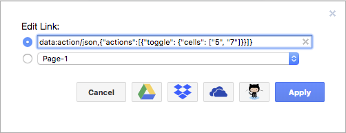
Example 1 — toggle cells by ID
data:action/json,{"actions":[{"toggle": {"cells": ["5", "7"]}}]}
Shows or hides the cells with ID 5 and ID 7, depending on their current visible state. See this example in the online editor.
Example 2 — open a page and highlight a cell
data:action/json,{"actions":[{"open": "data:page/id,1"},{"highlight":{"cells":["2"],"opacity":100, "color": "red"}}]}
Opens the page with ID 1 and then highlights the cell with ID 2 in red at 100% opacity.
Example 3 — show all tagged cells, then hide some by tag
data:action/json,{"actions":[{"show": {"tags": []}},{"hide": {"tags": ["pipe", "water"]}}]}
Shows every cell that has a tag, then hides the cells with the tags pipe and water.
Reference: action JSON
A custom-action link is encoded as data:action/json,<JSON> where the JSON looks like:
{
  "title": "Optional title",
  "actions": [
    {"fadeIn": {"cells": ["cellA", "cellB"], "delay": 400}},
    {"wait": 500},
    {"highlight": {"tags": ["urgent"], "tagsMatch": "or", "color": "#ff0000"}},
    {"fadeOut": {"layers": ["layerId-1"]}}
  ]
}
A page-level animation is the same shape under a single animation wrapper with optional loop and enabled fields:
{"animation": {"loop": false, "enabled": false, "steps": [ … same step objects … ]}}
The runtime flattens nested {animation: {steps: […]}} wrappers at dispatch, so the two formats are interchangeable. Both loop and enabled default to true and are omitted from storage when at their defaults, so existing diagrams stay byte-identical. When enabled: false, Editor.playAnimationOnGraph returns null — chromeless autoplay skips the script.
Selector fields per action
Every targeting action accepts these on its inner object:
| Field | Type | Meaning |
|---|---|---|
cells | string[] | Cell IDs. "*" matches every cell. |
layers | string[] | Layer cell IDs. Every descendant of each listed layer is included (resolved at runtime, so newly-added cells in the layer are picked up). |
tags | string[] | Tags to match (combined per tagsMatch). |
tagsMatch | "and" (default) / "or" | How tags combine. |
excludeCells | string[] | Cell IDs to remove from the result. "*" excludes everything. |
The runtime resolves cells via cells ∪ layers ∪ tags (de-duplicated), then removes excludeCells as the final pass. So {cells: ["*"], excludeCells: ["cellA"]} always means "all cells except cellA" regardless of where the cell originally came from.
Navigation transitions
The scroll and viewbox actions accept an optional smooth: true to animate the change:
{"viewbox": {"x": 100, "y": 50, "width": 400, "height": 300, "smooth": true}}
{"scroll":  {"cells": ["cellA"], "smooth": true}}
In the dialog this is exposed as the Transition checkbox. In chromeless / lightbox mode it arms a CSS transition: transform on the SVG root group so the next pan/zoom animates with an ease-out curve. In the editor (with scrollbars) the zoom snaps and the scroll position tweens via requestAnimationFrame.
Tags action
The tags action operates on global tag visibility, not on cells:
{"tags": {
  "toggle": ["important", "draft"],
  "hidden": ["archived"],
  "visible": ["release"]
}}
toggle flips visibility for the listed tags, hidden forces them off, visible forces them on (and hides every other tag). All three fields are arrays.
Legacy: persistent actions with transient: false
A handful of effects — Show, Hide, Toggle, Set Style, Toggle Style — originally mutated the diagram model: clicking a custom link with one of these actions would write to the file, land on the undo stack, and propagate to collaborators. That behaviour is preserved for back-compat via a transient: false opt-in on the action's parameters.
The flag is intentionally hidden from the visual editor — there's no checkbox, no menu entry. You add it by hand in the JSON view (toggle Edit Text in the header) or via the external link tool:
{"show":  {"cells": ["A"], "transient": false}}
{"hide":  {"cells": ["B"], "transient": false}}
{"toggle": {"cells": ["C"], "transient": false}}
{"style": {"cells": ["D"], "key": "fillColor", "value": "#ff0000", "transient": false}}
{"toggleStyle": {"cells": ["E"], "key": "shadow", "defaultValue": "0", "transient": false}}
With transient: false the action goes through the normal model edit path: the change is undoable, saved to the file, and propagated to other people viewing the diagram in realtime.
Use this only when you genuinely need the change to stick — e.g. "click to permanently reveal details" patterns where the next viewer should see the revealed state. For presentation animations, layered hover-reveal effects, and lightbox playback, leave the default in place: those should be transient so each viewer starts from the canonical diagram.
Effects not in the list above (fades, wipes, pops, opacity, highlight, flow, scroll, viewbox, select, open, tags, wait) are always transient — there's no transient: false equivalent for them, because they have no model-mutating path.
Troubleshooting
"My animation doesn't play in lightbox mode."
Make sure the page has at least one step. Animations only autoplay when the diagram is loaded with ?lightbox=1 (or via View > Chromeless), and only if animate=0 is not set in the URL.
"Clicking my cell doesn't fire the custom action."
Custom actions only fire on data:action/json,… links and only in lightbox / read-only mode. In the editor, the link is editable instead of clickable — preview each action from the dialog's ▶ buttons.
"My cells stayed faded out after I closed the editor." The dialog restores opacity (and the hidden-tag set) automatically on close, but if you exported the diagram mid-preview the export captured the preview state. Reopen the editor and click Reset, then re-export.
"I want a custom action that permanently shows / hides a layer."
The default Show / Hide / Toggle effects are transient — the change reverts on refresh. To make them stick, add "transient": false to the action's parameters via the Edit Text view (see the Legacy section above).